
Hand Lettering is not one of my strong suits, at least compared to the many wonderful hand letters of our class and the world.
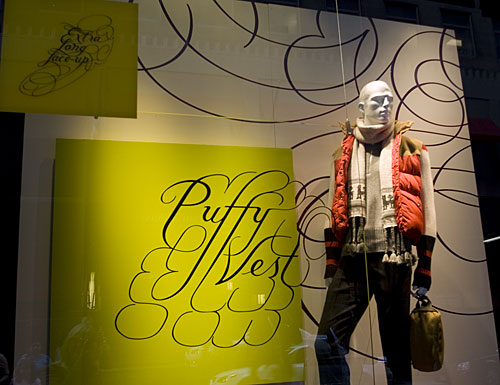
That’s one of the reasons I’m so attracted to Marian Bantjes’ work. She does these insane, ornate letterforms and designs but they are still marketable and can be applied to different companies. I often refer to this Sak’s Fifth Avenue display she designed because how it achieved the difficult balance of artsy and marketable.
I also thought of her today because she is known for her Valentine’s Day cards, every single one unique. Here are a couple from a couple years ago. She used vintage postcards and did some hand lettering on them.


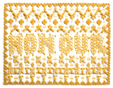
I like her interest in making the ordinary extraordinary, as with her macaroni art.
Here is her TED Talks video from a few years back. It’s a bit long at 20 minutes, but definitely worth the watch. In it, she discusses the balance of individuality in corporate work.
For Jill’s type class, we got the chance to practice some custom letterforms. I chose to make a package design for a fictitious “Pastor Will’s Soap” company, the other choices being chocolate or a cigar box. I really focused on the religious aspect this and referred to old, intricate bible covers with dark colors and Celtic manuscripts. What I like about these biblical references are how the ornamentation is so well integrated with the type. That is what I wanted to emphasize in my final design.
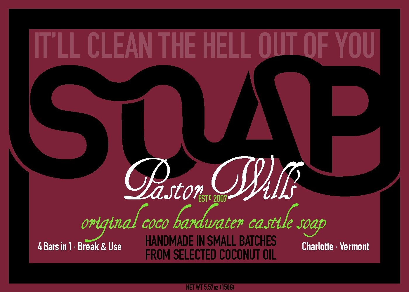
It was a really great project since we were not allowed to use illustration, really just simple ornamentation. I like mixing old musty colors with new fresh ones, bold sans-serif with squirrelly script.
Comments are closed.