Menu Close

Month: January 2015

Week 4: Bit o Branding

This week I decided to switch gears and focus on branding. They already have a logo and do not want the concept changed, but it needs to be streamlined and tweaked. It also needs a concise color palette and typefaces because they are not solidified.

Here are their previous logos:

logo

main-logo-vectorHere is the logo that I polished a little for a shirt they had produced.

logo draftBut I do think it needs to be simplified.

Hum Creative came in on Monday and they went over some great ways to concept. One that I implemented was to create 3 simple moodboards with different color palettes, photo styles, and typefaces. I came up with the adjectives by doing a brain dump and trying to establish their target audience.

Brain Dump

Brain Dump

Here are the three moodboards:

moodboards-03 moodboards-04 moodboards-02They are rough but still convey 3 distinct moods and feelings. I will run them by Brian and main tool library users to see which one they are leaning towards.


Week 3: Boner Kill

After a particularly deflating week, I finally feel back on track. Instead of trying to organize all of the backend server stuff now, I will wait until it is all nicely designed and then try to migrate it over.

I was able to get a lot of great feedback from the survey I put out. Here are some of the results:

survey-response

Some unexpected conclusions I made from this survey is that many people use the “inventory” page that has over 1,000 tools and is not easy to find tools on. I assumed because it was so terrible to use that nobody was using it but it seems people will carry out a task if they are determined enough. So I will design the inventory page even though in actuality it make not be able to look like that.

It seems that the functionality of the site is not so much the problem as is more the hierarchy of information. So I will instead use this as an opportunity to bring in more users and urge them to donate. Donations are a big part of keeping the Tool Library alive and it is not very easy to do this on the current site. I will also add an area to buy their shirts since that is another way to get funds.

I started wireframing, keeping in mind existing users who want easy access to the tool inventory and new users who want to learn more about the Tool Library.

IMG_1127

IMG_1128 2

IMG_1126

Here is the more finalized wireframe for the homepage. The yellow squares are photographs and the blue are vector illustrations, like simple logos.

wireframes-01I am little behind on my schedule but I made a lot of progress and will be able to catch up.


Week 2: Research and Survey

This week, I gained insight on the needs of the website by talking to the manager (who is also my boyfriend). There are a few parts of the website that are problematic and features that could be added. My aim is to reduce the number of phone calls and emails so that the Brian’s time could be better used. So I determined the main topics people contacted him about.

  1. Hours. This one is the most obvious, as most people visiting the site just want to be able to see the hours that they are open. I will make this big and and the top of the page so it is very easy to find.
  2. Available Tools. This one is a bit more difficult. myTurn is an open source program many tool libraries use, but it was created specifically for the West Seattle Tool Library. It is through this program that the inventory of the tools is displayed on the website. I may not be able to fix this issue, but hopefully can implement easy fixes such as a better search bar for people who are looking for a specific tool, and featuring the categories of tools rather than the 100 pages of individual tools.
  3. Membership. You can sign up for a membership online, however it is a 2-step process that nobody ever does. This could be better displayed and organized. If more people sign up for a membership online, this would save quite a bit of time for Brian during Tool Library hours.
  4. Gift Membership/Donation. Currently, you can buy a gift membership for someone or donate money to the Tool Library through Paypal. The problem is that when people buy a gift membership, they receive nothing and Brian receives no confirmation, so there is no prove that they bought it for someone. This is similar to donating through Paypal. One way I was brainstorming to solve this is to create a WooCommerce store. A gift membership or donation could be products in the store, and then they receive some sort of PDF or email. Also, Brian would be able to see purchases in WordPress or perhaps he could get a confirmation email. Another part we can add is to be able to buy merchandise through this store, since they have shirts that are already printed. And yet another part is that they are starting to refurbish and then sell tools for the shop. This could be integrated here if they like, or they could use their existing method of just selling through craigslist.
  5. Email. The issue above reminded me that Brian does not have a legitimate email address through their domain. When I get access to their server, I can hopefully set that up for him.

I did a sitemap of the existing website. It’s not beautiful, but it gets the job done.

Screen Shot 2015-01-15 at 1.33.10 PMI also made a survey that the Tool Library will be sending out to all of their users. Within a week, hopefully I can draw some meaningful conclusions from it.

So armed with these three resources, I will make an updated sitemap this week, which can of course change depending on new or changing information. I can then start wireframing and making a moodboard. This will give me and the client a better idea of what I will be designing, plus I can solidify their branding.

Week 1: New Quarter! Redesigning the West Seattle Tool Library Website

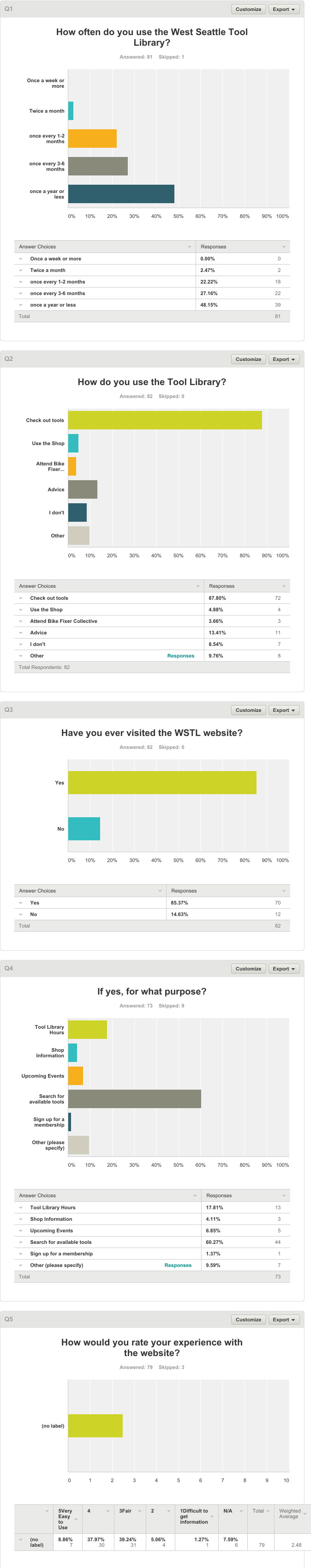
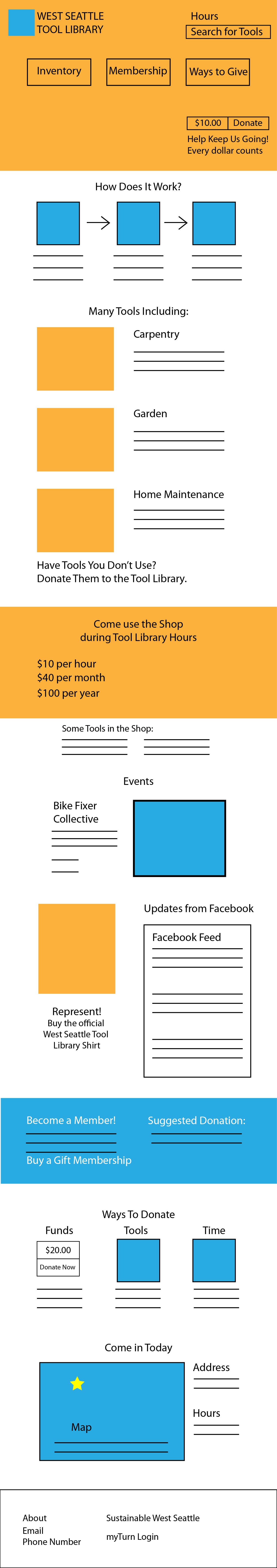
This quarter I will be redesigning the West Seattle Tool Library website. Here is the homepage:

Screen Shot 2015-01-08 at 12.49.23 PMIt has many familiar problems. Mostly, the lack of hierarchy hinders the user. It is difficult to parse through all of that information. My aim is to make this website a treat to go to, and to give the user the information s/he needs quickly. This will theoretically decrease the number of phone calls and emails made for basic questions of which my boyfriend is the only one that responds to.

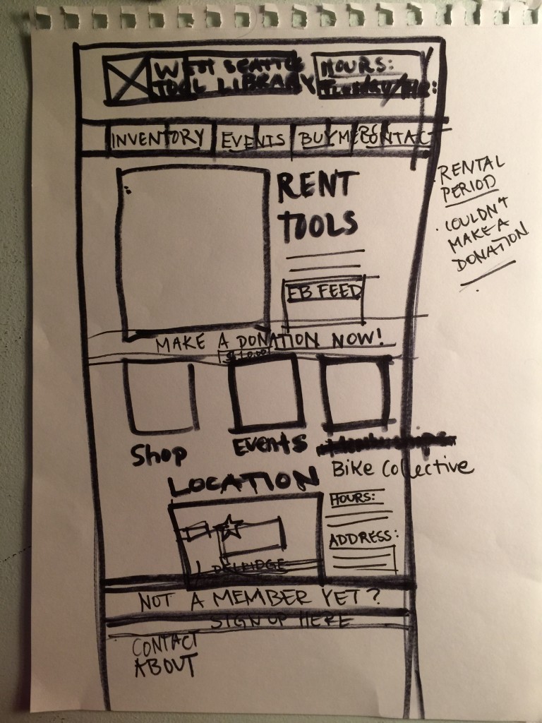
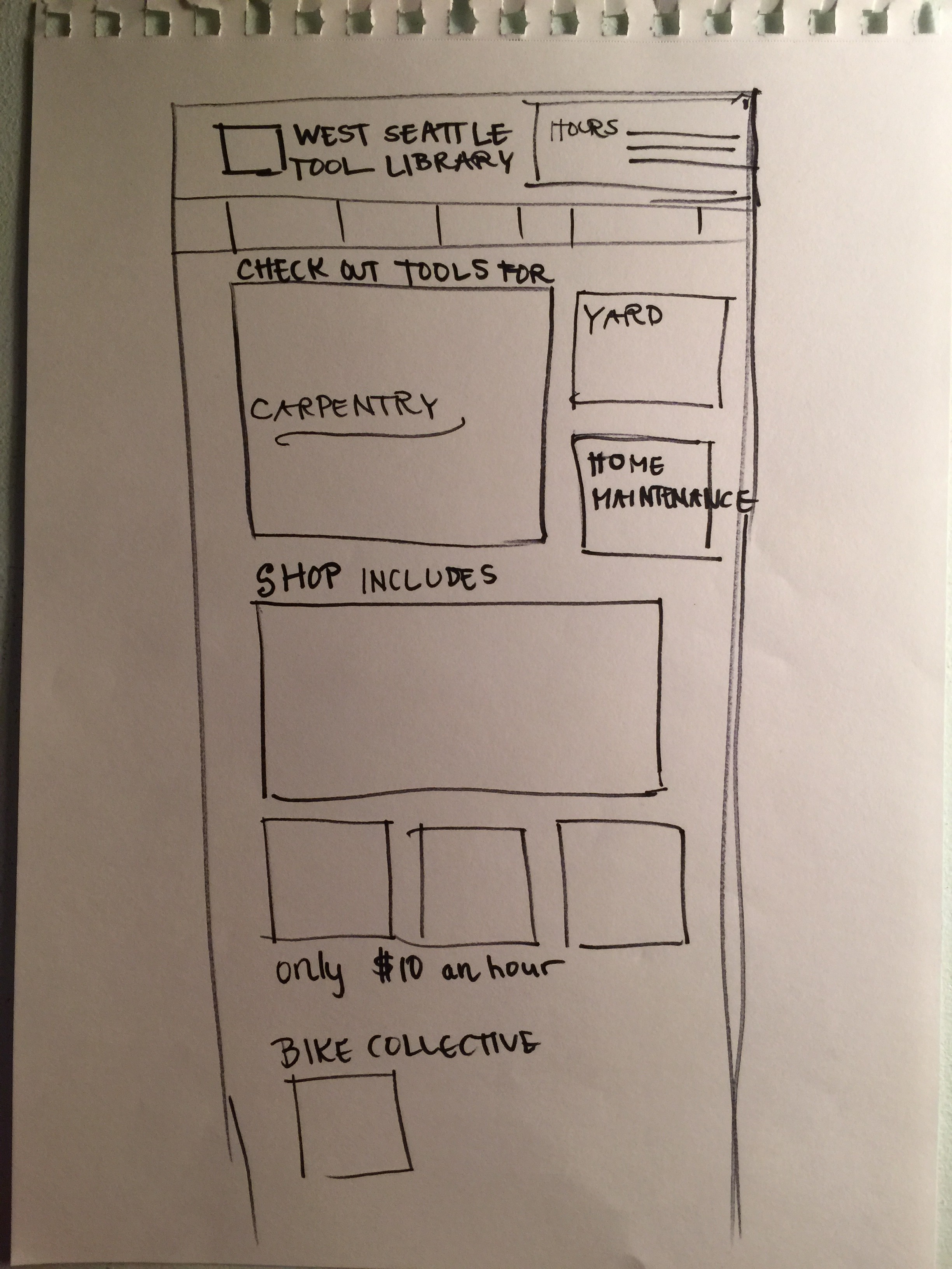
I will also tweak their branding. I know that they want to keep the same basic idea, but I will streamline everything so they have consistent branding between different all venues.

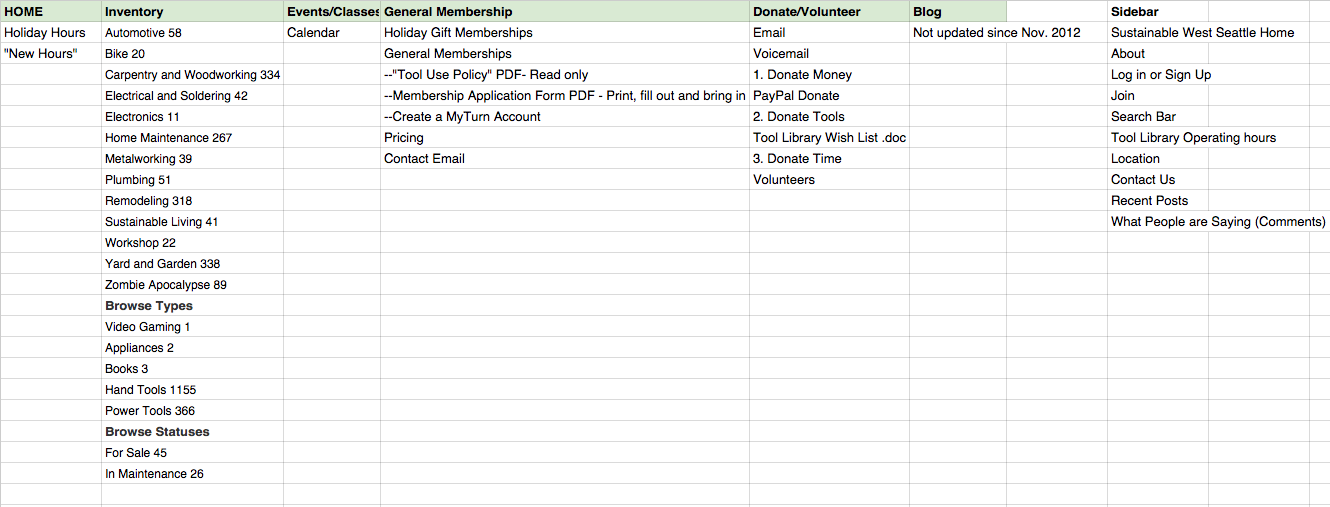
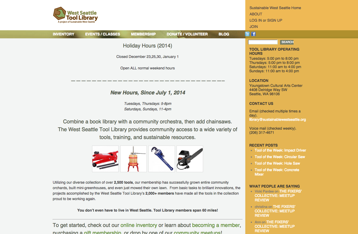
The challenge in this project is integrating the open source “myTurn” software which shows an inventory of all of their tools.

screencapture-wstl-myturn-com-library-inventory-browse
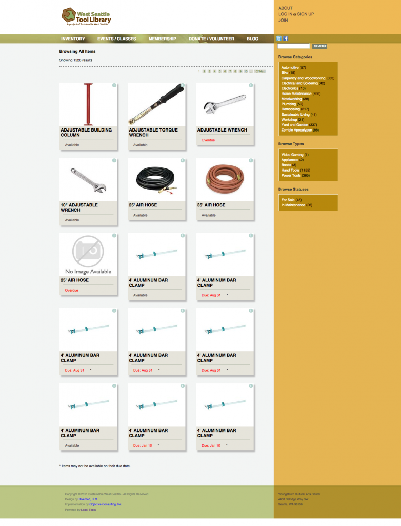
Ideally somebody could see in real time whether the tool they want right now is checked out or not. However, there are 101 pages of what you see above, making this feature essentially unusable. There are categories on the side that could help, but these could be better displayed. If possible, I could combine duplicates and it could say “5 of 12 checked out.” I will have to see if this could be achieved. I will start by contacting the people who designed this originally, and reaching out to the creator of “myTurn.” This is an integral part of the website so it would be great if it was cohesive with the rest of my branding.

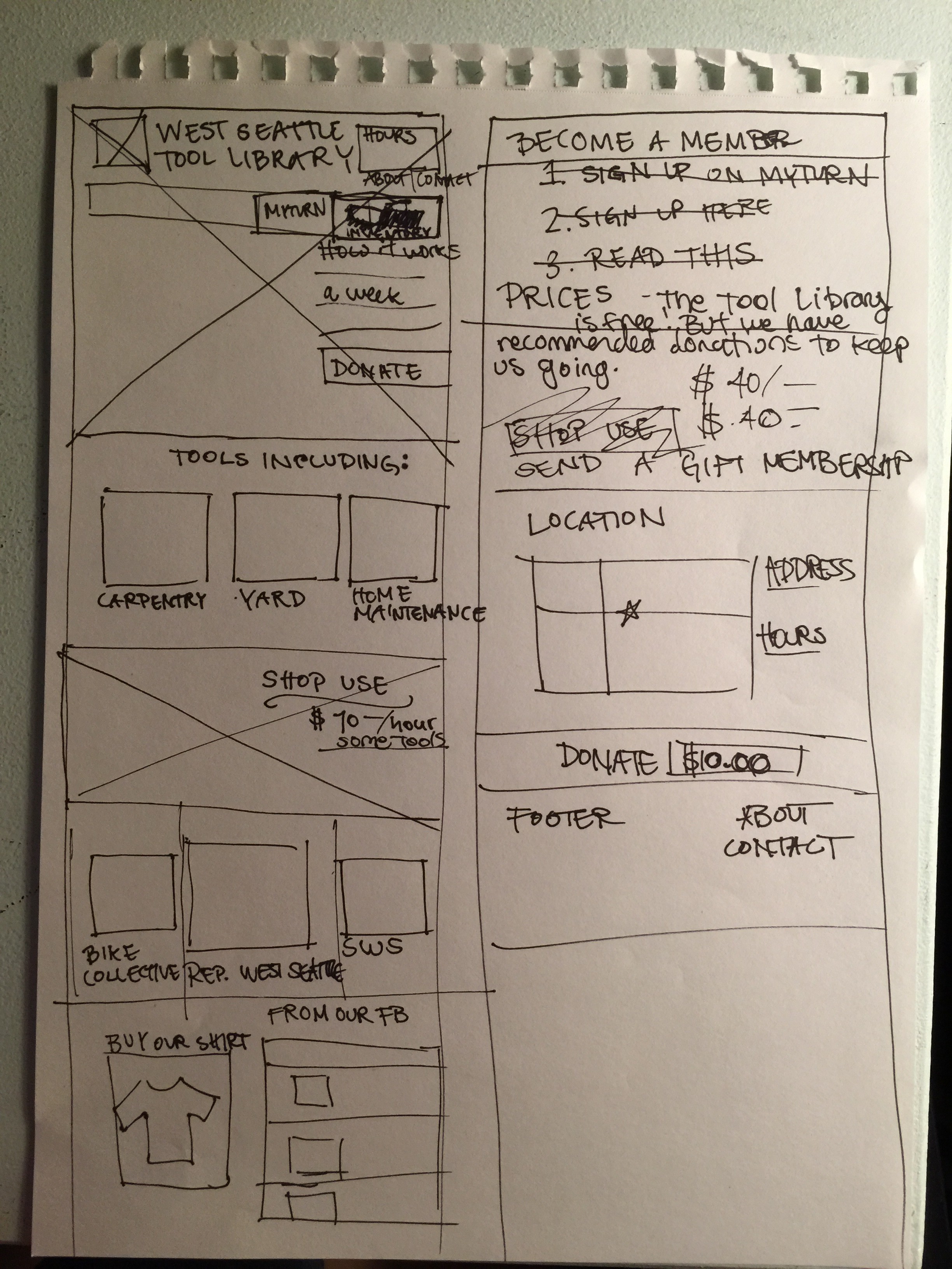
Other parts I have to take into consideration is just the fact that many people have had their hands in this website, so it may be difficult to parse through everything. There is also the fact that I will have to build this website somewhere and then migrate it to their existing URL which may have hiccups.

In any case, here is the loose timeline I have planned:

Screen Shot 2015-01-08 at 12.45.01 PM


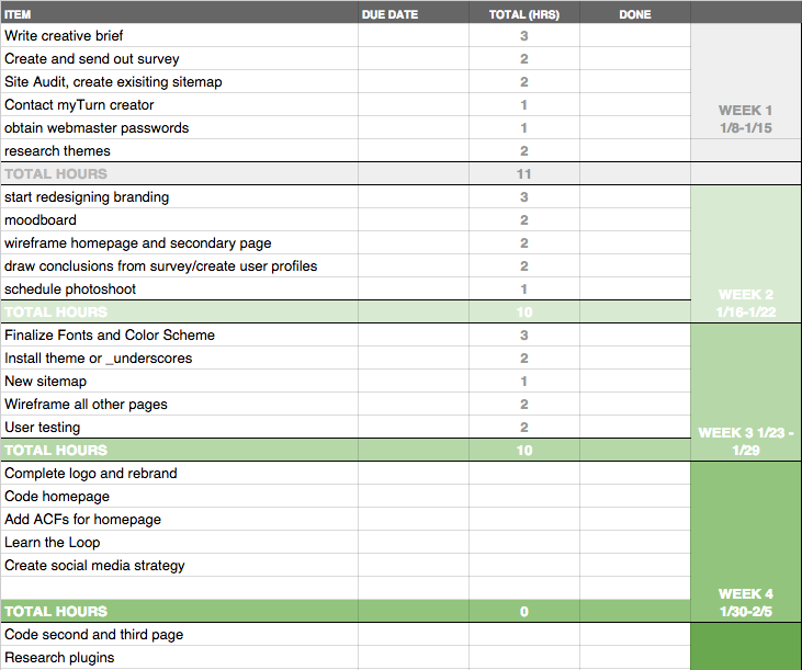
Click it for the live google spreadsheet.
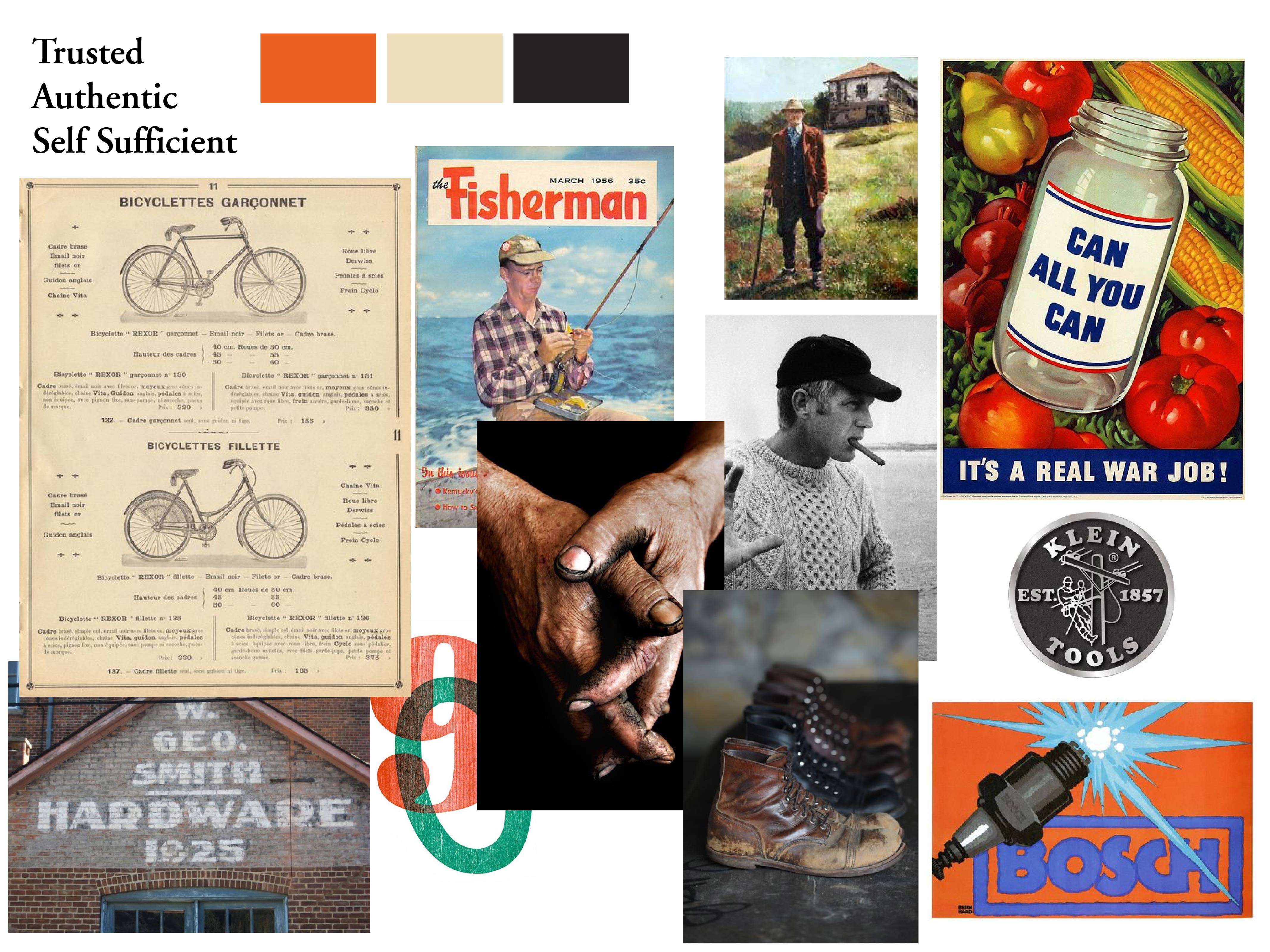
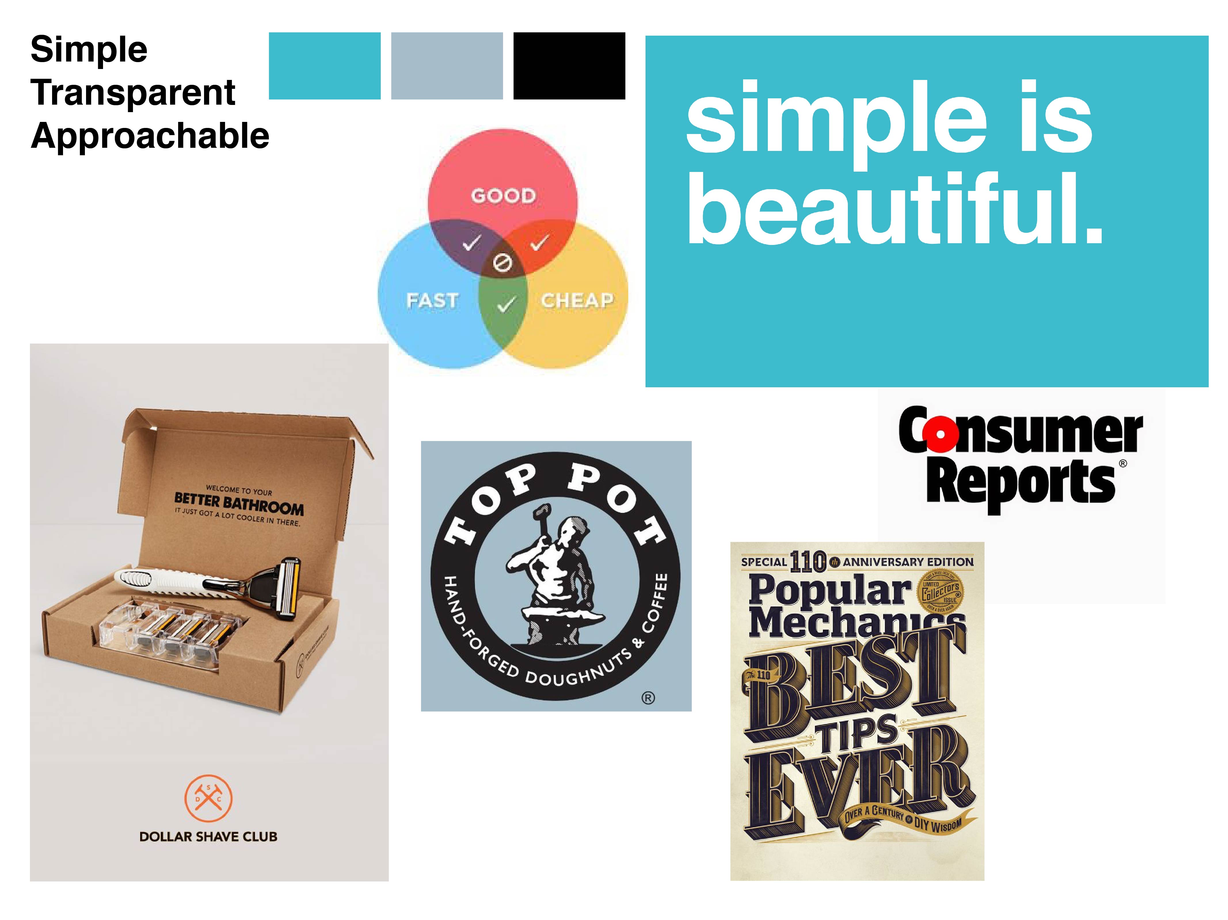
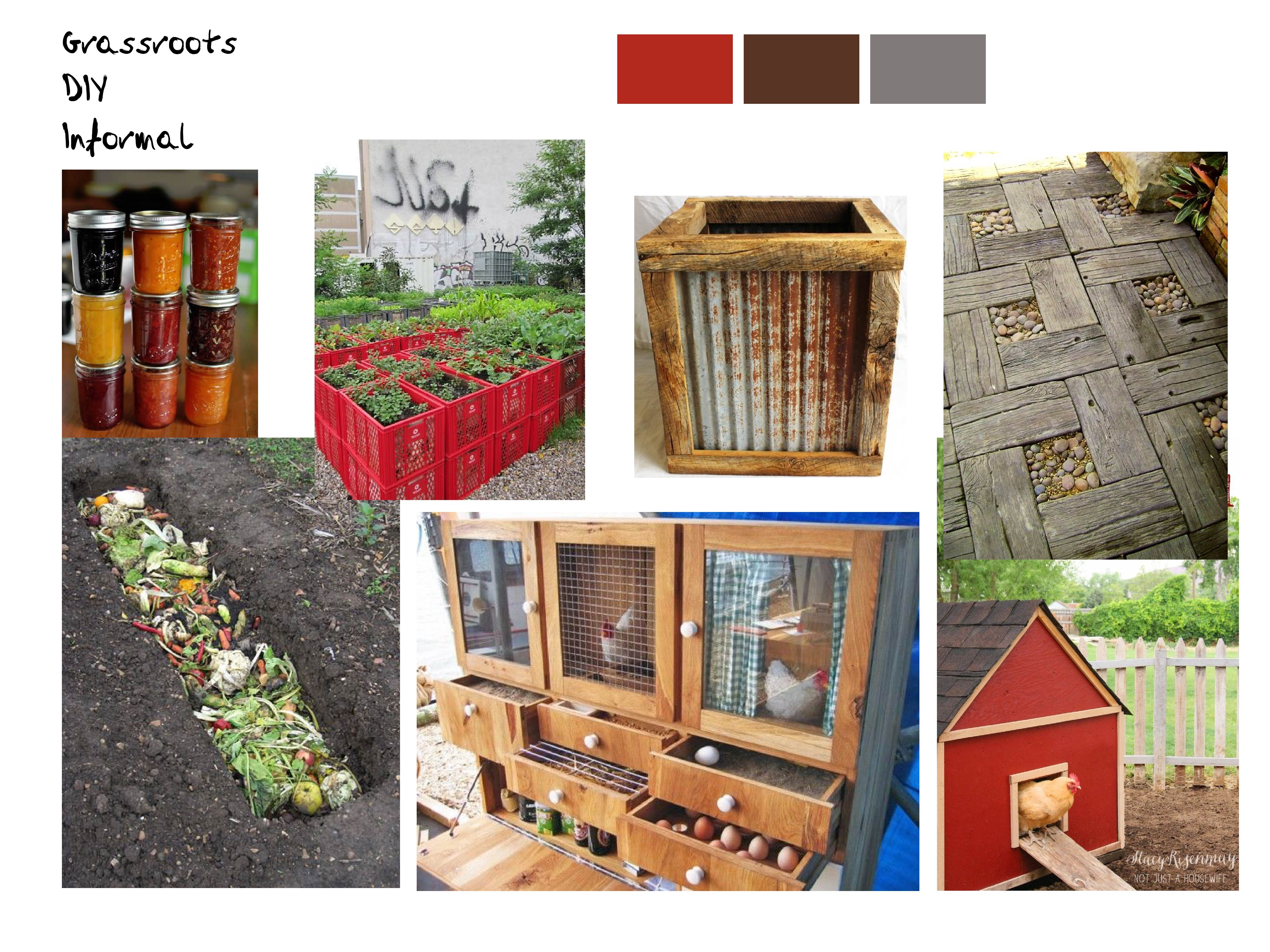
© 2024 Seana's blog. All rights reserved.

Theme by Anders Norén.