Menu Close

Month: October 2014

Week 5: Prototyping with Axure

This week, I am slightly behind schedule only because I have decided to prototype my WordPress Redesign with Axure. So I watched all of the tutorials on their website and a few on Lynda.com.

I was able to add a lot more interactivity on the homepage. I have started on the second page as well, I just have to add more options. However, now I know how to use Axure more efficiently, this should make the designing the rest of the pages a lot easier. I also interviewed a novice WordPress user and received some helpful feedback from her that I can use on my draft.

Here is the prototype I have so far:

Screen Shot 2014-10-27 at 9.35.52 PM

Week 4: WordPress Dashboard and Hompage

This week I finalized the sitemap and the homepage of the Dashboard (which I am now calling the Control Panel). I use the word “finalize” loosely since I am working in an agile method. Once I get three or four pages prototyped, I can do another round of testing and edit accordingly.

In trying to think of ways to illustrate the changes I made to the sitemap, I created this slightly Frankenstein chart:

sitemap and homepage_Page_3It’s more a way to visualize where I deleted or reallocated features of WordPress.

I then went ahead and redesigned the 1st page in InDesign with Interactive Features.

sitemap and homepage_Page_4

However, I realized that though this makes it easy to style, it will take too much time to make this whole project in Interactive PDFs. I then started using some prototyping tools. The one I settled on was Axure because it is very easy to get interactive elements online quickly. I have made the 1st page with the basic structure. It lives here. Here is a screenshot:

Screen Shot 2014-10-20 at 9.17.19 PM

Using Axure did put me a little behind schedule, but I kept it pretty padded so that I could account for changes. In the long run though, this will be a lot easier and help keep me on track. Also, learning a prototyping tool with be helpful no matter what.

I also met with the E Fad today. Here are some things he brought up that I wanted to keep in mind:

  • Autosave for drafts (Like Google Drive)
  • Confirming leaving the page if there are unsaved changes
  • 1 column/2 column layouts
  • “Disraction Free Writing” (Was I the only one who didn’t know about this?)
  • This dude who redesigned google news.
  • How to apply the simplicity of the WordPress mobile app in my desktop redesign.

mobile_main mobile

Week 3: Updated Sitemap and Control Panel

For my WordPress redesign, I have updated the sitemap a second time. The first (in the previous post) was based on the input I received from my Concept Codify results. I took that into consideration when I designed it again. This time however, I tried to understand the functions of all of the menu items. I even did a mini card sort of the “Reading” and “Writing” items in “Settings” since those titles do not clearly convey what their functions are. I could then hypothetically move its functions to other menu items. This also allowed me to delete unnecessary items and restructure the Dashboard.

Another change I made was changing the name “Dashboard” to “Control Panel.” Dashboard does not convey the fact that this is the main hub of where you edit your website.

Here are other menu items that I was able to delete:

  • Links
  • Tools
  • Store
  • Feedback
  • Screen Options
  • Omnisearch
  • Appearance > Customize
  • OpenID

Here are some other changes I made:

  • Discussion to Notifications
  • Sharing to Social Media
  • Writing/Reading (combining into blog settings)
  • Akismet Stats (combine with regular stats)
  • Store combining with My Upgrades to “Upgrades”
  • Added “Follower Settings” from Reading

Here are my updated sitemap: sitemap2


Here is the updated Control Panel. I still have to design the default home screen, then I can get into styling.


Screen Shot 2014-10-13 at 4.34.54 PM

Week 2: Sitemaps, Research, and First-Click Testing

Click sitemap to see it in 100%

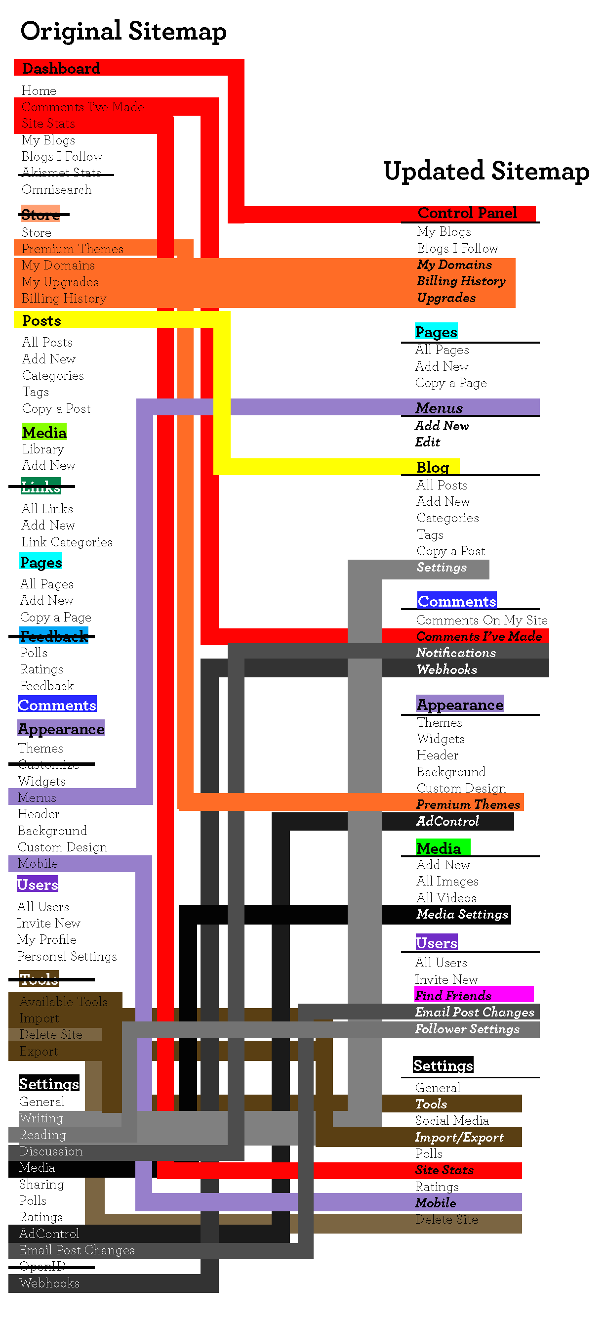
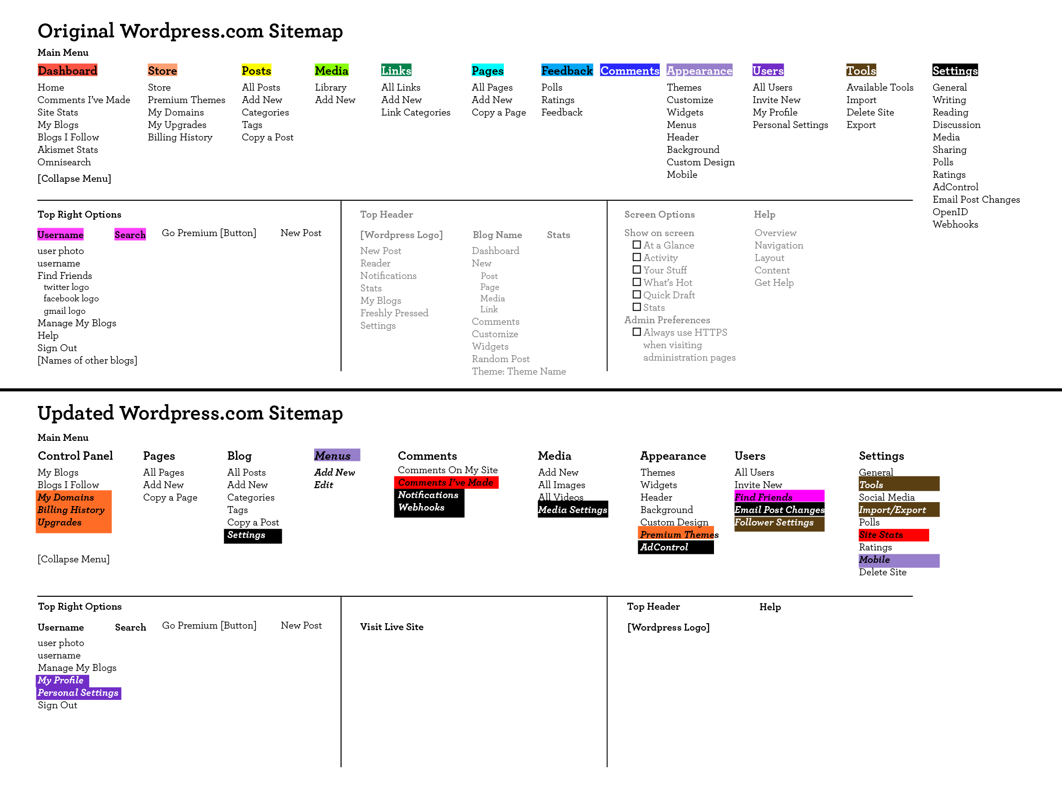
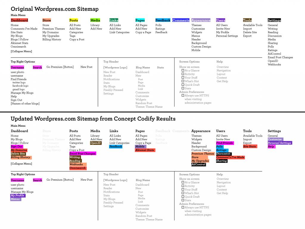
Click the sitemap to see it in 100%

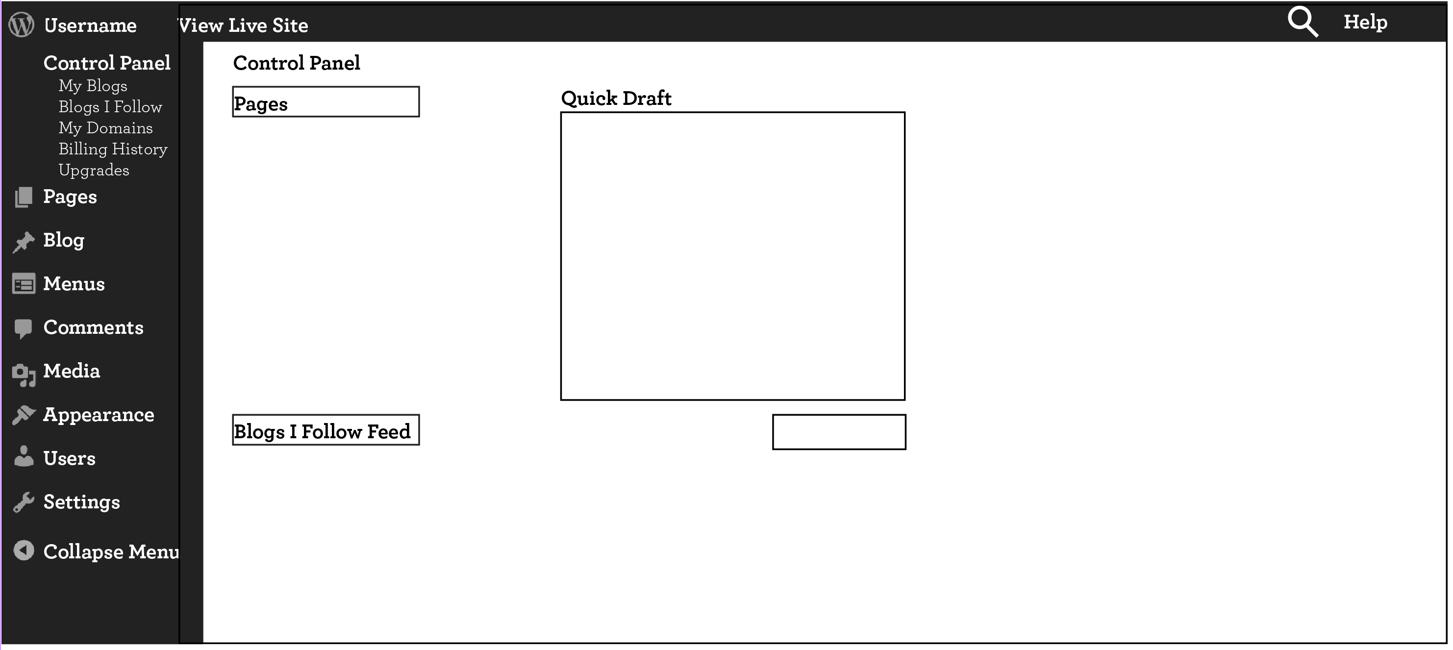
The top half of the image above is the original, existing WordPress.com sitemap. I put all of these on Concept Codify for participants to card sort. Some of them were very familiar with WP, others have never touched it. I got around 10 responses which helped me formulate the sitemap in the bottom half. It is color-coded in these garish colors to track the changes of what moved to which category. This is not my final sitemap, but I will take it into consideration when redesigning the final.

Research was at first a bit more difficult to come by than I expected, but I did manage to find some helpful facts.

  • As of August 2013, 23% of all websites are powered by WordPress. (Source: W3Techs.com)
  • 61% of websites that use a CMS (Content Management System) use WordPress. (Source: Ibid.)
  • Only 1% of WordPress users pay money to WordPress. This is generated mostly from WordPress.com sites that can host and buy domains through WordPress directly. This reinforces the importance of designing specifically the WordPress.com Dashboard. (Source: Forbes.com)
  • In its own survey of 30,000 people, WordPress found that:
    • 69% use WordPress as a CMS (Content Management System)
    • 20% use WordPress of a hybrid CMS/blog
    • 6% use it as just a blog
    • 7% use it as an app platform  (Source: thenextweb.com)
  • Matt Mullenweg, the founder of WordPress, has said that the future of WordPress is in the social, mobile, and as an application platform. (Source: Ibid.)

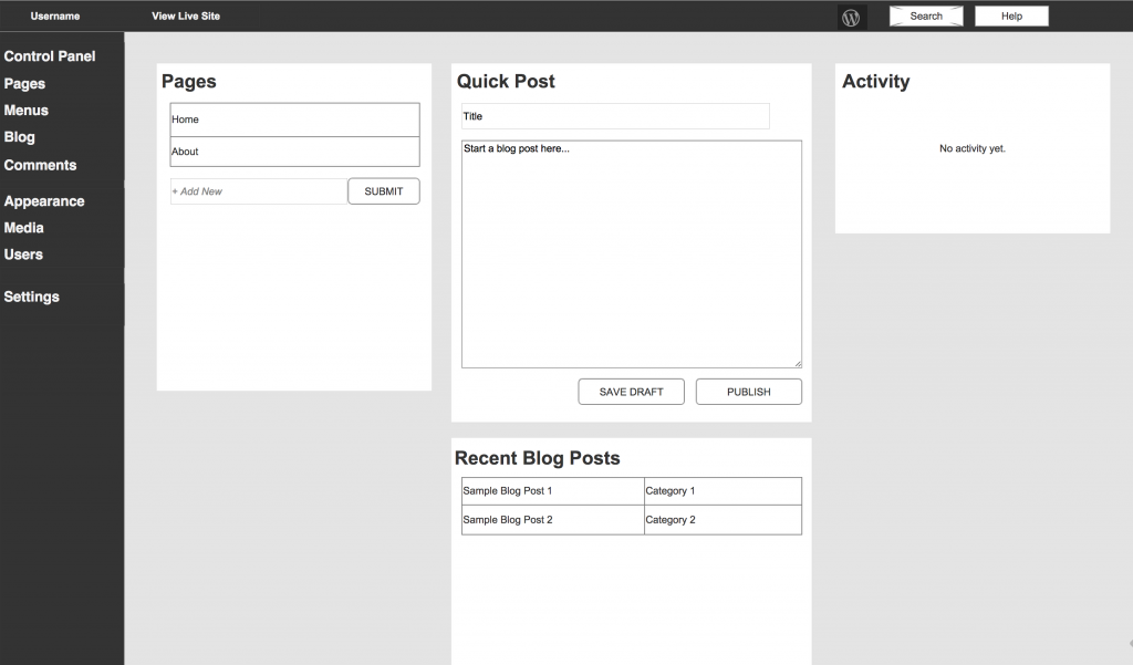
The fact that most users, almost 70%, are using WordPress as a CMS and not as a blog shows the importance of a complete redesign, not minor tweaks. Because WordPress was born as a blogging platform, it still has an innate focus and priority toward blogging. However, this is not the major goal for most people. For example, the difference between “Pages” and “Posts” gets easily confused and it is not clear which one pertains only to the blog. Also, it is not clear where the blog lives.

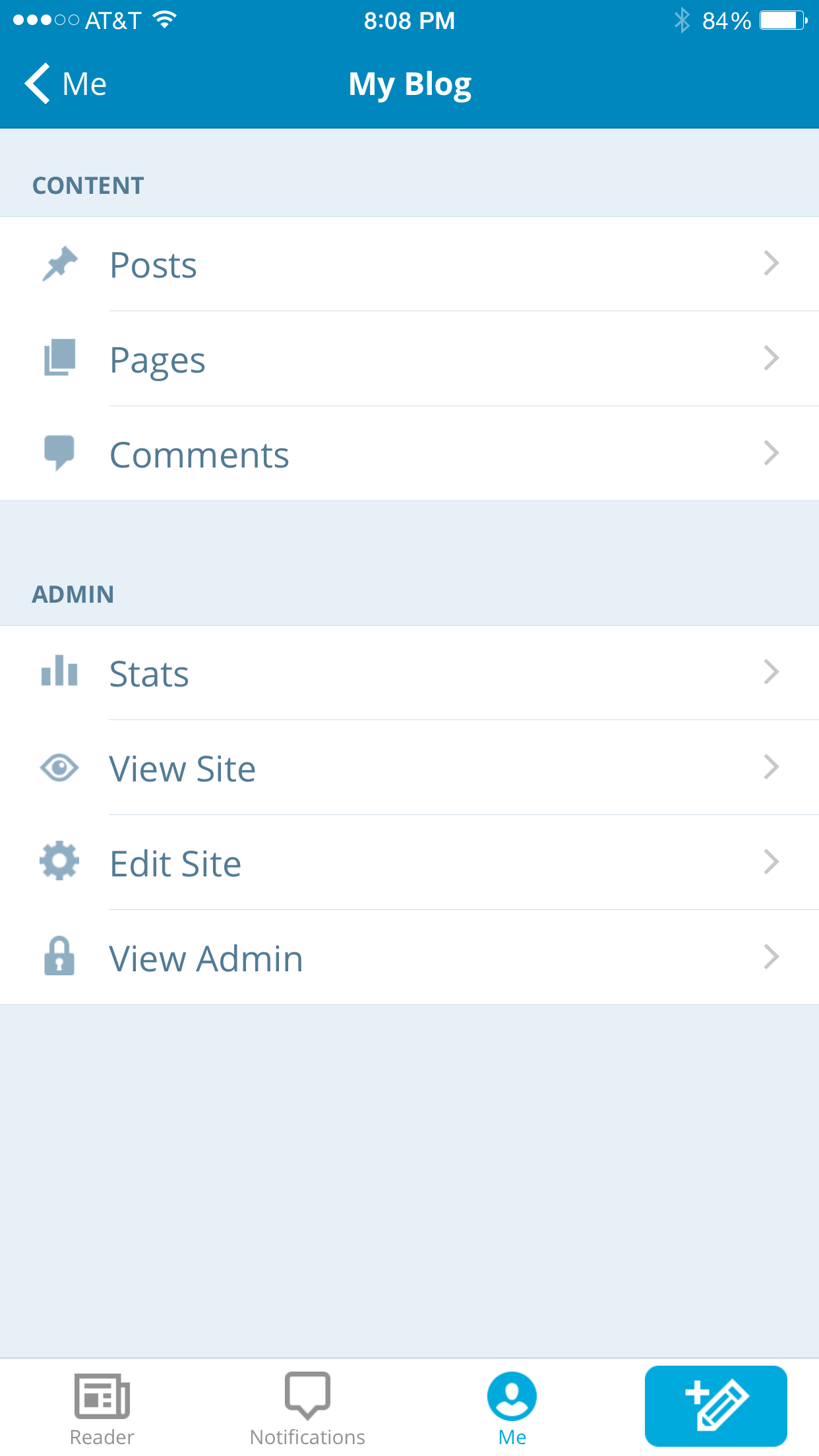
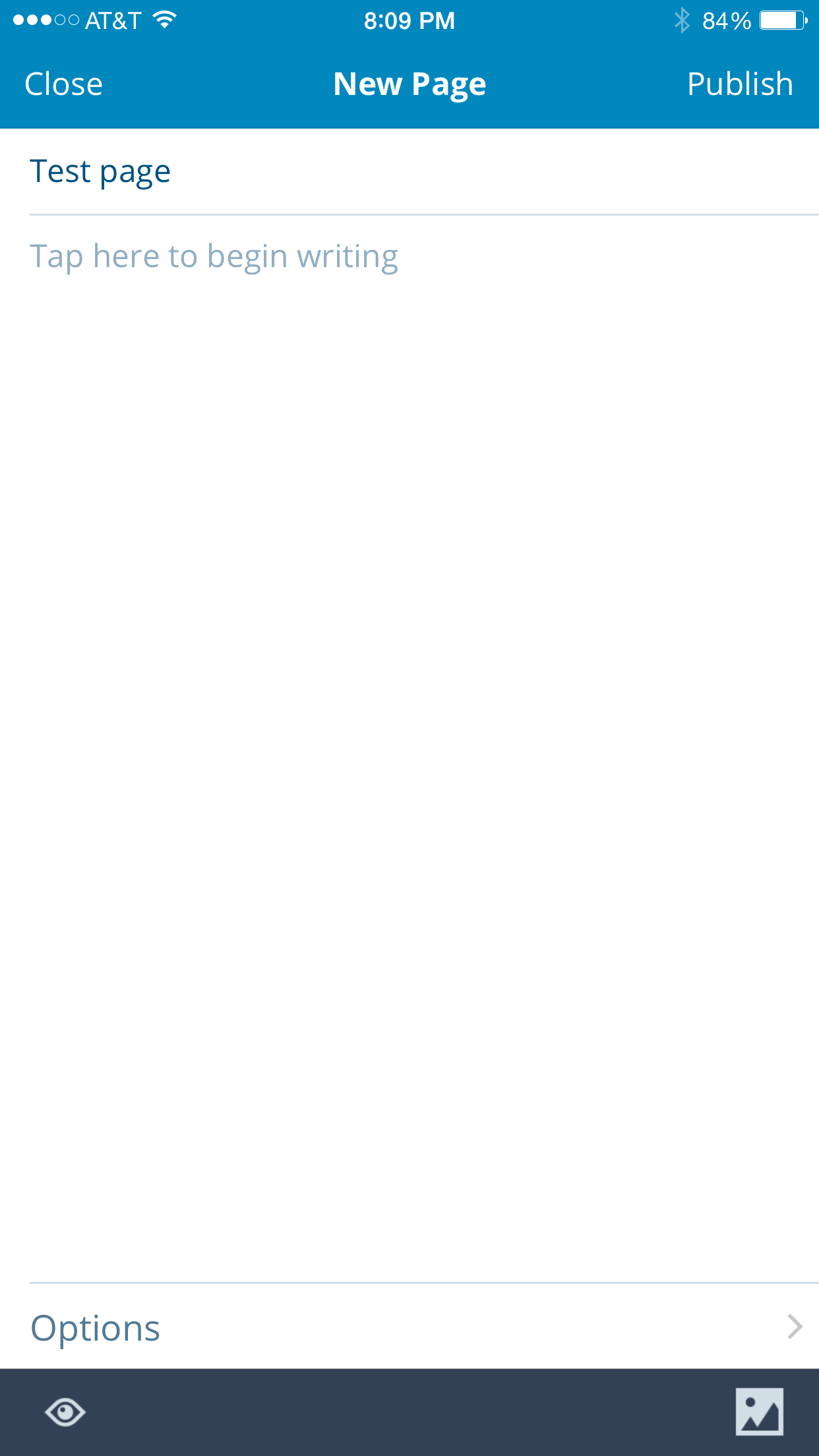
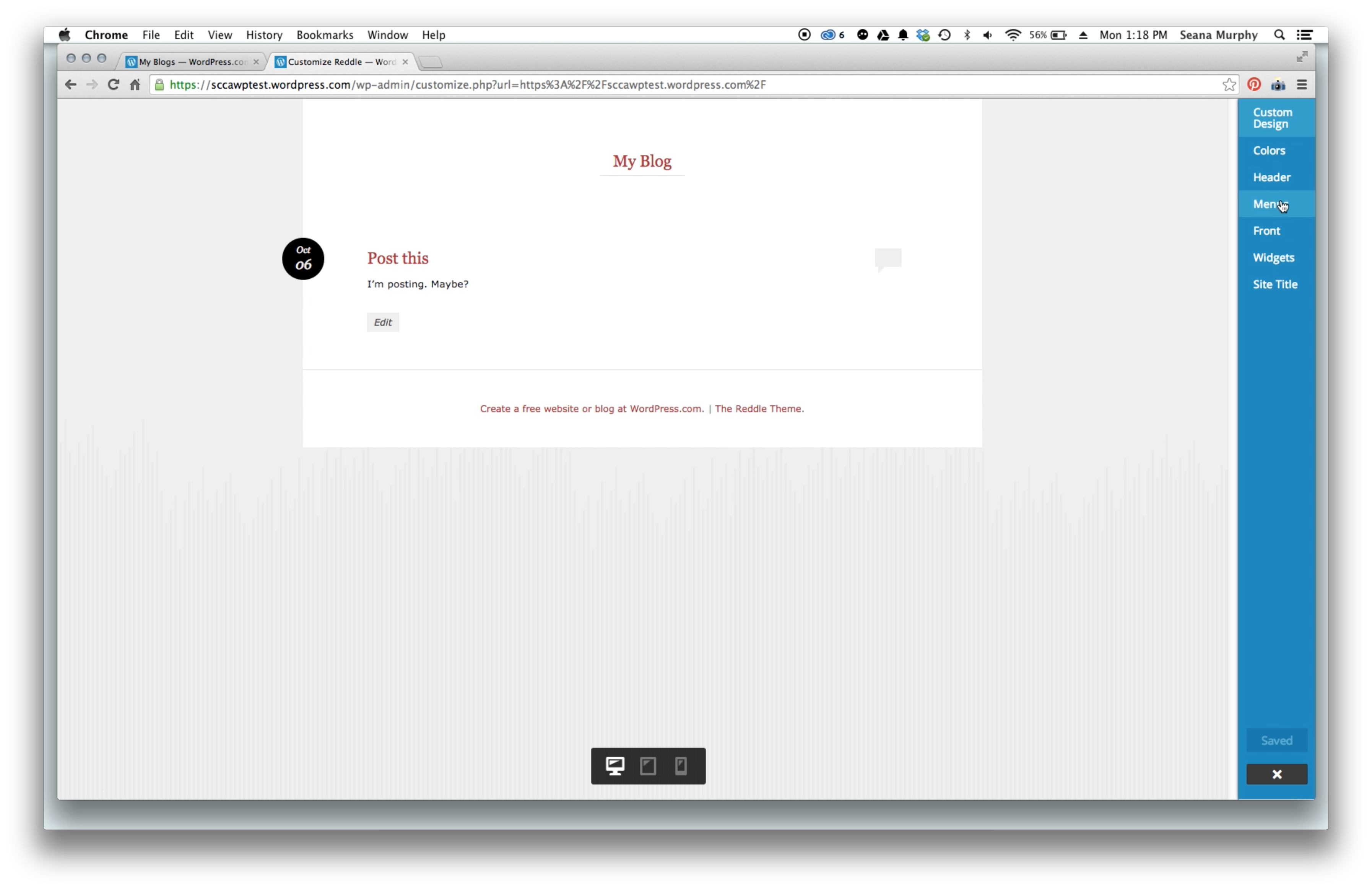
I gained this insight through some first-click testing. I have set up a default WordPress.com blog without adding or removing any pages or information. I then gave my users three tasks which I deemed were important through my research.

  1. Create a new Blog Post
  2. Create a new Page
  3. Make this Page part of the Main Menu (and make this Menu visible)
  4. (I also wanted to see how easy it was for users to switch from the dashboard to the live site.)

I have done two of these interviews and plan to do another one before tomorrow. Mac’s built-in Quicktime Player also has a handy “record screen” feature while using the mic so I was able to record exactly the steps my users took while talking through it.

My first user was a 65-year old female who is a beginner on WordPress.com and mostly uses the computer for writing on the word processor and normal internet use.

My second user was a 35-year old male who is also a beginner on WordPress but comfortable with more technically-advanced software and internet browsing preferences.

I gained helpful insight through this first batch of testing. My thinking is to tailor WordPress.com editing to a more novice user because the point of a CMS like WordPress is for it to be passed onto an individual or company. They are able to edit their website without having to know the nitty-gritty insides of it. Even the more advanced WP user can appreciate a more intuitive interface.

A screenshot of one of the first-click user testing

A screenshot of one of the first-click user testing

© 2024 Seana's blog. All rights reserved.

Theme by Anders Norén.