Menu Close

Category: New Media Blog (page 1 of 2)

#TBT


Remember this?
sketches8It was Jill’s first day of class icebreaker. The first person (me) writes down a short sentence. Notice I was trying to be cute with my nod to typography. The next person draws an image of the sentence. The next person looks at that image and writes a sentence explaining what it is, and so on and so forth, like an effed up game of telephone. It is an exercise about visual communication (plus it makes a great drinking game). The way mine turned out always made me laugh and as our first year at SCCA is coming to end, I thought it would be appropriate to share it.


Question Reality

This poster was for a fictional gallery exhibit and was done entirely in Photoshop.

murphy_exhibitposterI kept wanting to do something with the Seattle skyline and one of Galyn’s terrariums inspired me to put it in one. Combined with a photograph of April’s hand holding some terrarium tweezers, I had my poster. It helped me learn quite a bit about photoshop techniques but that I have a lot more to learn.

#TBF

jillsproject

This throwback Friday (that’s not a real thing I know) is our first real design poster done waaay back in Fall 2013. I have been meaning to add this to my blog for a while, so here it is. Looking back, I still very much like this poster though I feel as if that is a bad thing. You are probably not supposed to like things you did in the beginning of the year because you are supposed to think hey I could have made it so much better. But whatever, I like it.

Something that Jill said I could improve on, which I agree with, is the “Canadian Tulip Festival 2014″ type treatment. I wanted to tie it in with the graphite pencil drawings, but it isn’t well incorporated into the design.

But like I said, I like it. I pulled Dutch still-life paintings of tulips and photoshopped them together. Then I traced over it with pencil and scanned it in. My concept was: join in with the tradition of the tulip festival while making your own traditions.

Package Design

IMG_3616 copy

This is our first project for Package Design Class. Our parameters were that it had to be a glass bottle, but no wine or hard liquor. Our target audience was middle America, which to me meant our instructor did not want any hipster nonsense.

As a vinegar lover, I went for Apple Cider Vinegar and channeled that vintage-inspired fruit box style. I was picturing a label that had not changed in 50 years except for a couple gradients here and there.

Swiss Layout Poster

murphy_cutsofapig_pgs_Page_14This is my International or Swiss Style inspired poster. This style has always been challenging for me. It is easy to appreciate its beauty when done correctly but so difficult to do well. I am happy with the final result and learned a lot about the grid structure but know that I have much to improve on.


Cookbook Cover

cookbook1Last week, we designed an organic cookbook cover. I used some of the photographer’s work since they already had beautiful existing food photography.


Spring Quarter Starts

For the first week back for spring quarter, we did a photoshop exercise. Using our own faces as inspiration, we put images as replacement squares on our portrait.

murphy_portraitIt was a fun exercise that taught us a bit about photoshop. I also used photos that I took while on vacation so it was fun to sort through them and see what fit.

Banner Ads with Chateau Ste Michelle

In our blogging module today, we talked a little about the importance of banner ads. With print slowly dying, web advertisements are becoming even more important. I’ve had a little bit of experience designing flash ads in the past and know that it can be difficult to make them look good. It is something that you know everyone is annoyed by so you are always balancing eye-catching and obnoxious.

With this in mind, I approached Chateau Ste Michelle’s banner ads with simplicity. These ads are meant to be on “The Stranger” website so we could use a little humor.

screenshotwithads

So here is the screenshot of what the website would look like three different-sized banner ads. I noticed that the larger ad looks a little disjointed because of the stacked images, but I didn’t mind it. It looks more like content and less like an ad, which I think is good.

Here are the individual ads:

murphy_300x600

murphy_728x90 murphy_300x250


Slutting Up My Friends in the Name of Art

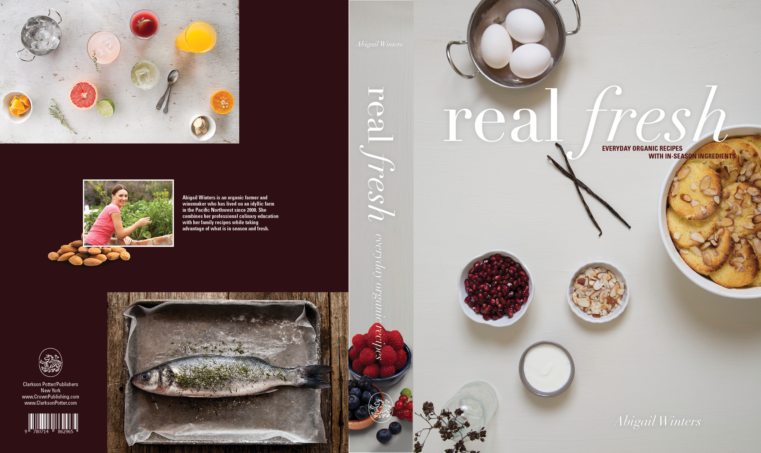
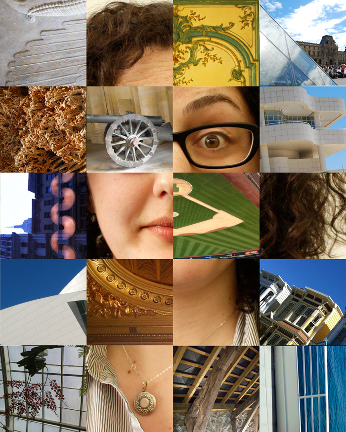
I would never say I am a “photographer” for fear of offending real photographers. However, I do enjoy putting whore-ish makeup on my friends (preferably after we have been drinking) and photographing them in various outfits and places. Then over-photoshopping their photos. It is a fun way to let loose and get out of my creative routine.

553230_10151084027161422_905609655_n

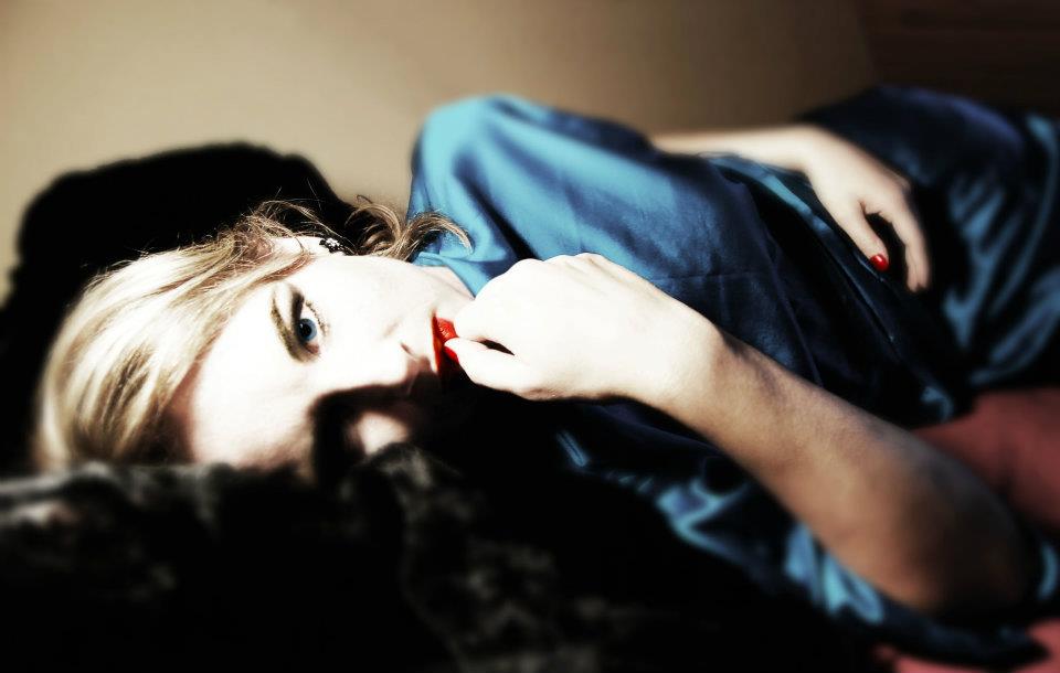
Here is an early example of photoshoots with friends. We were celebrating a girls’ weekend at our friend’s family’s beach house in Longbeach, WA filled with wine, tarot cards, and windy beach walks. I remember I had just watched a retrospective on Judy Garland’s life and became really interested in vintage photographs of actresses. It was amazing how much the actress’ appearance could change in a time before photoshop.

hezmarlene

483362_10151084027266422_1458283070_n

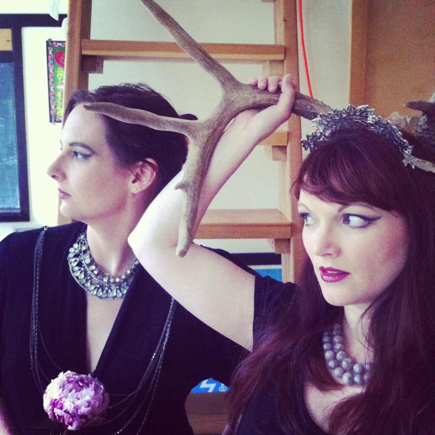
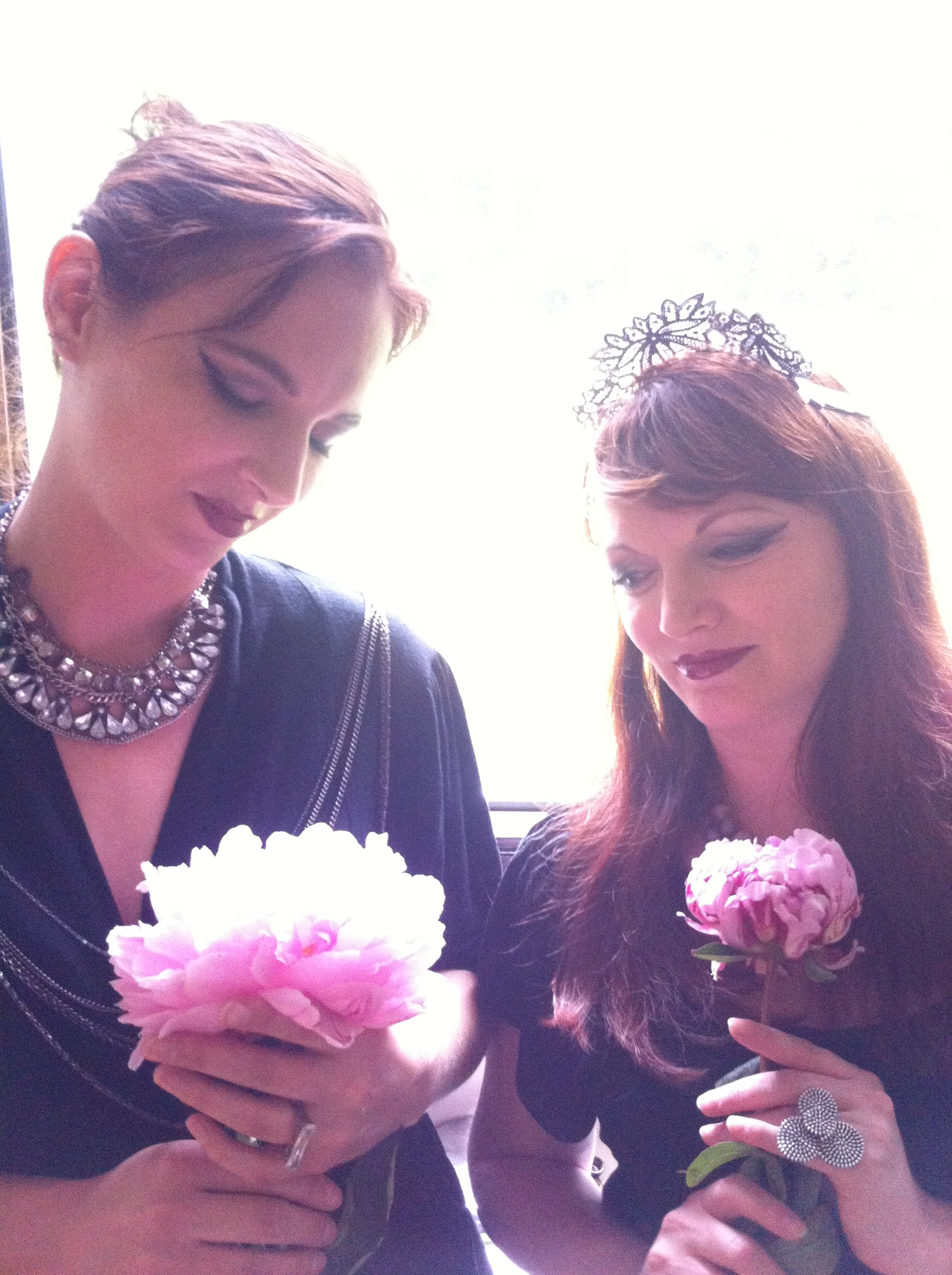
Another time at my place we did a more hipster-inspired shoot. I mean, anything is better with antlers right? I live in a loft with old wood floors so I made them just lay down and used that as the backdrop. We used some of my jewelry and I tried to get a little jesus-y with the light. It also didn’t hurt that I had happened to buy peonies, which worked themselves into the shoot.

IMG_2854

IMG_2798

IMG_2779

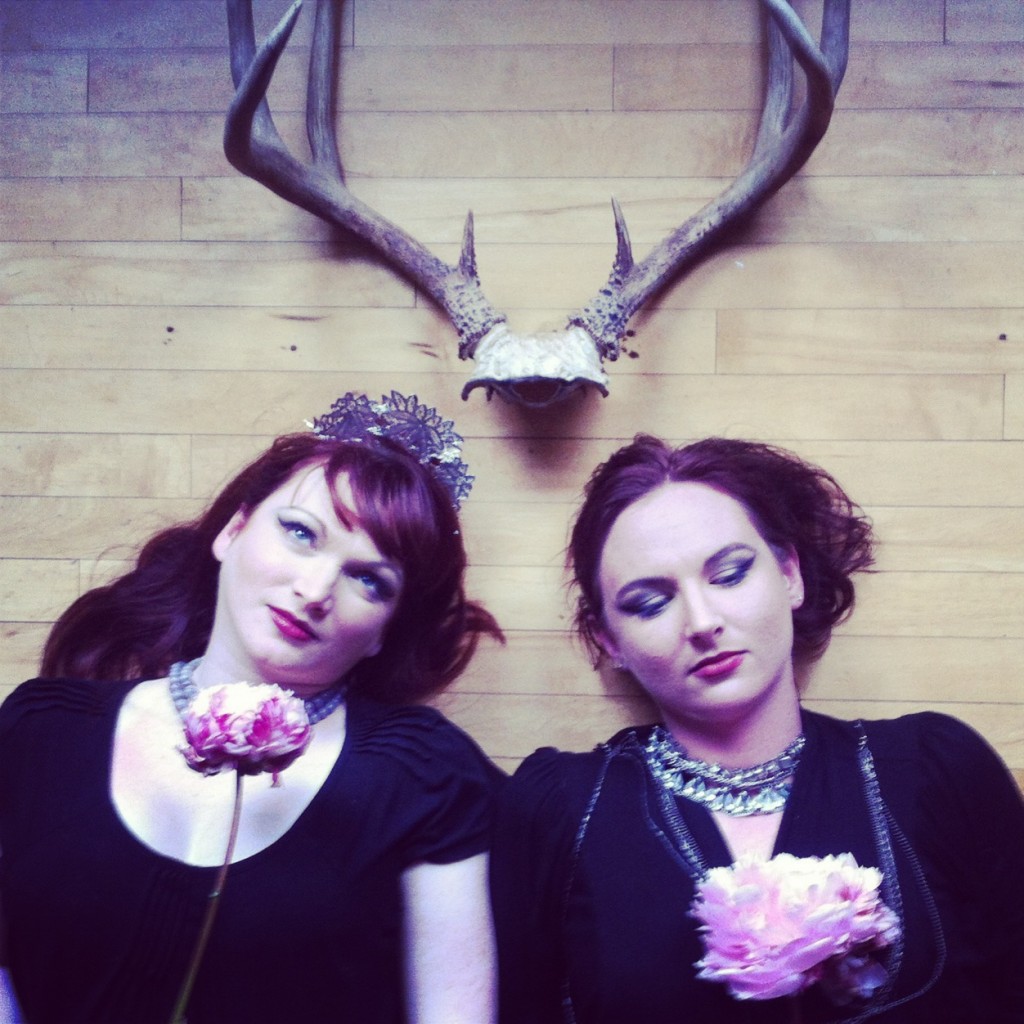
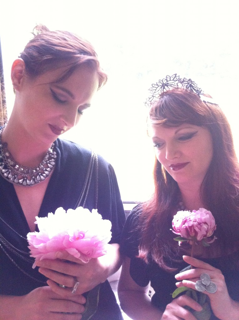
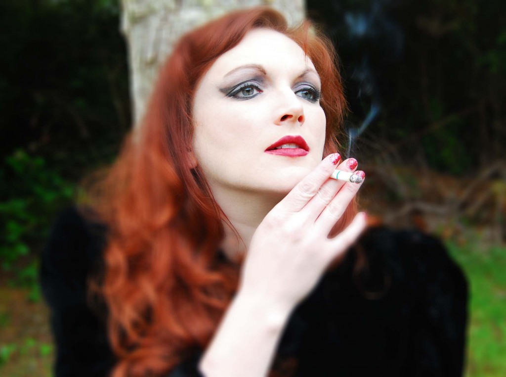
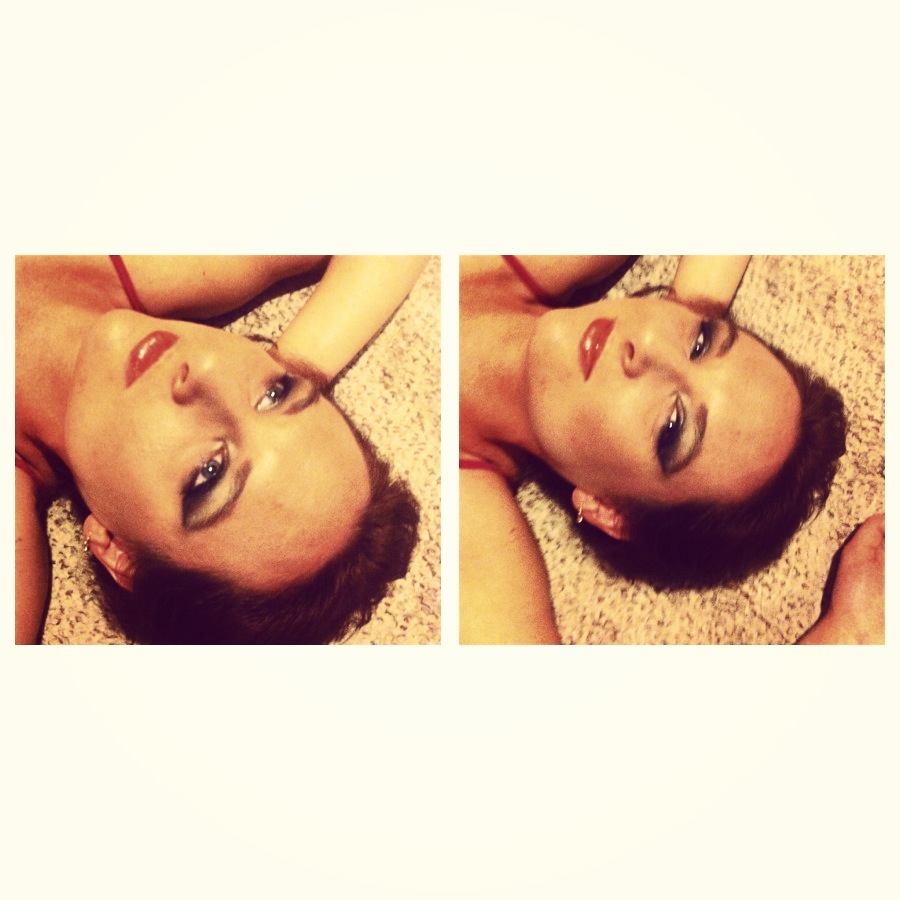
As you can see, my models/friends Angela and Heather usually come in a pair. Another time though, it was just Angela. Angela is an awesome model because she can really work her angles and isn’t afraid to take some risks. I call the one below a ’70’s porn star look.

IMG_2411

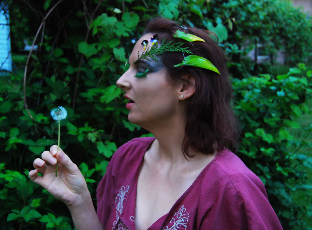
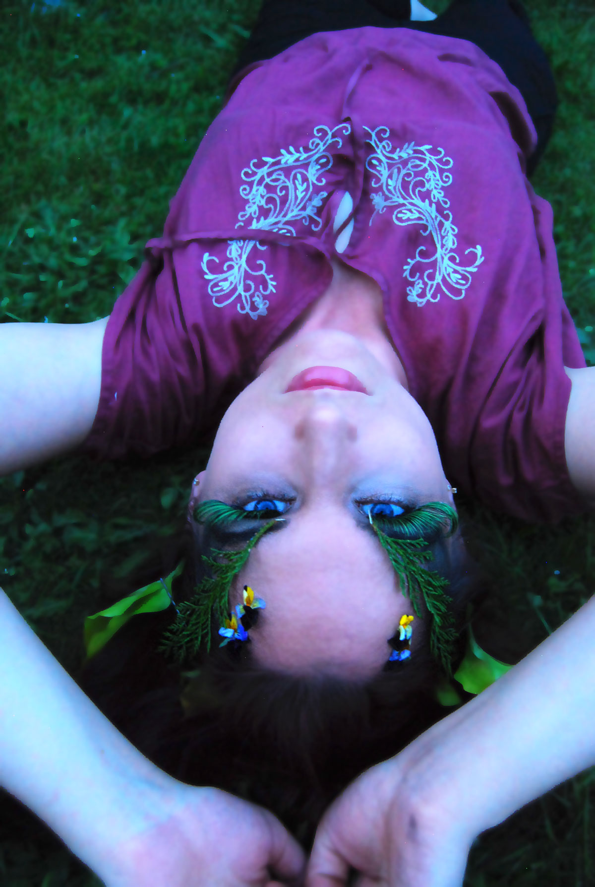
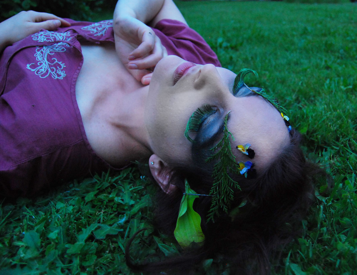
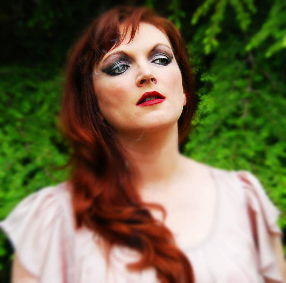
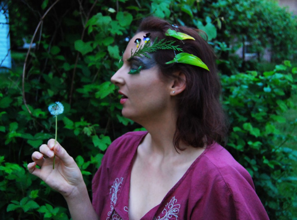
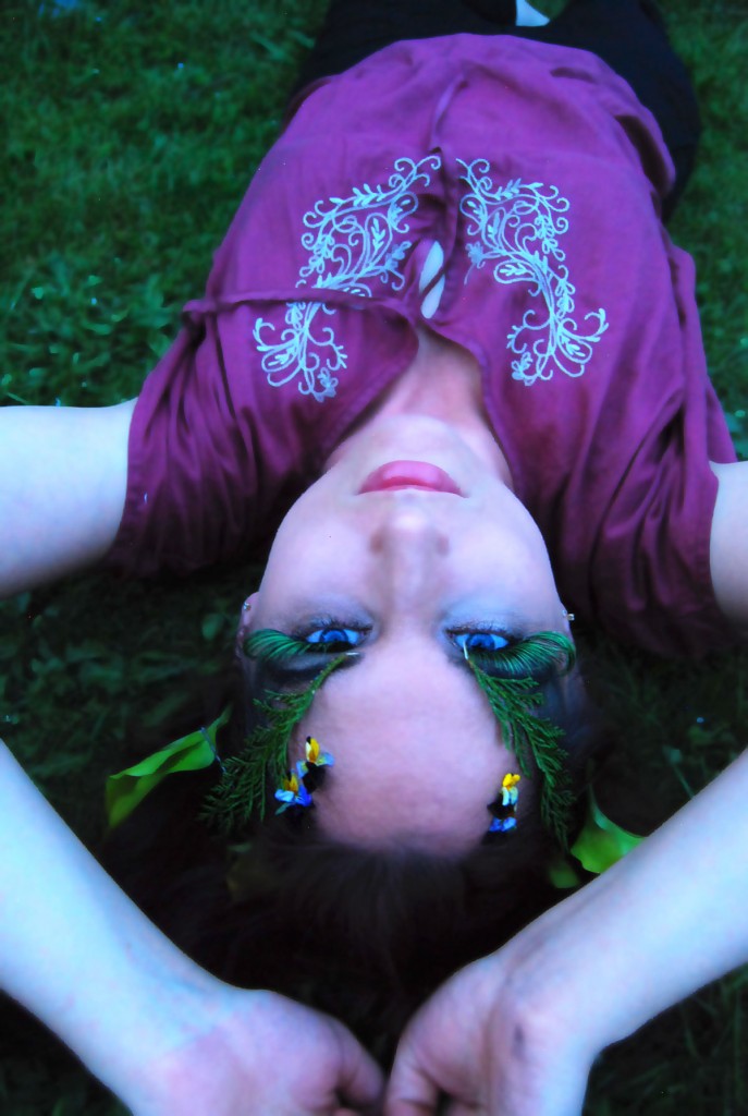
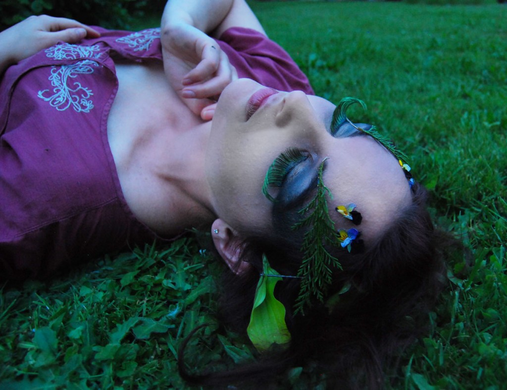
On another shoot with Ange, I was really feeling a wood nymph photoshoot with magical beings frolicking in the forest. Ideally, she would be nude but with sunsetting we didn’t have time to get to a more secluded spot. It is definitely another theme I would like to further explore.

final1 final3 final2

I have done impromptu photoshoots like these since I was young. My sister had a darkroom kit and we would do photoshoots and develop the photos together. It is something that I will always try to incorporate into my life.
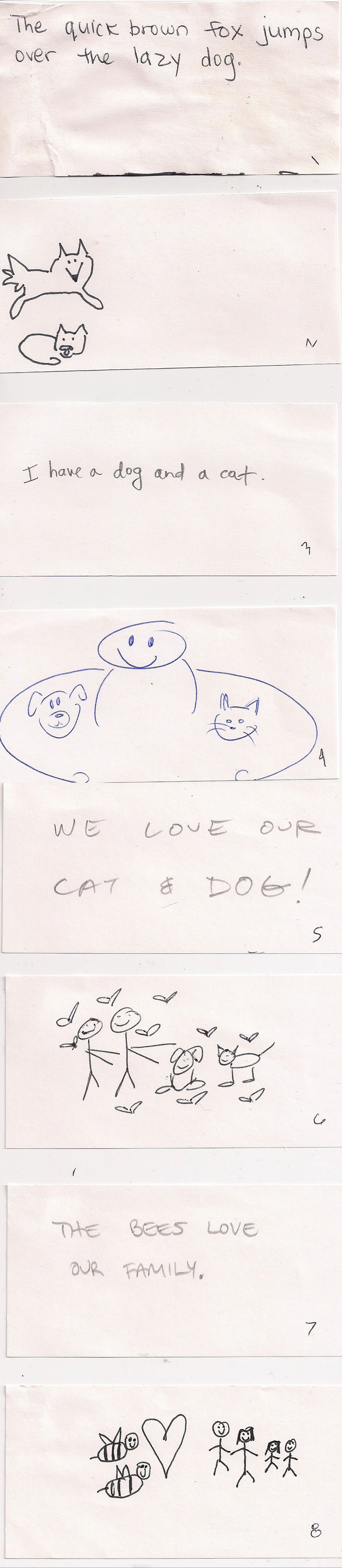
Lettering with Marian Bantjes

Hand Lettering is not one of my strong suits, at least compared to the many wonderful hand letters of our class and the world.

That’s one of the reasons I’m so attracted to Marian Bantjes’ work. She does these insane, ornate letterforms and designs but they are still marketable and can be applied to different companies. I often refer to this Sak’s Fifth Avenue display she designed because how it achieved the difficult balance of artsy and marketable.

I also thought of her today because she is known for her Valentine’s Day cards, every single one unique. Here are a couple from a couple years ago. She used vintage postcards and did some hand lettering on them.

I like her interest in making the ordinary extraordinary, as with her macaroni art.

Here is her TED Talks video from a few years back. It’s a bit long at 20 minutes, but definitely worth the watch. In it, she discusses the balance of individuality in corporate work.

For Jill’s type class, we got the chance to practice some custom letterforms. I chose to make a package design for a fictitious “Pastor Will’s Soap” company, the other choices being chocolate or a cigar box. I really focused on the religious aspect this and referred to old, intricate bible covers with dark colors and Celtic manuscripts. What I like about these biblical references are how the ornamentation is so well integrated with the type. That is what I wanted to emphasize in my final design.

Murphy_Pastor_Wills_Page_6

It was a really great project since we were not allowed to use illustration, really just simple ornamentation. I like mixing old musty colors with new fresh ones, bold sans-serif with squirrelly script.

© 2024 Seana's blog. All rights reserved.

Theme by Anders Norén.