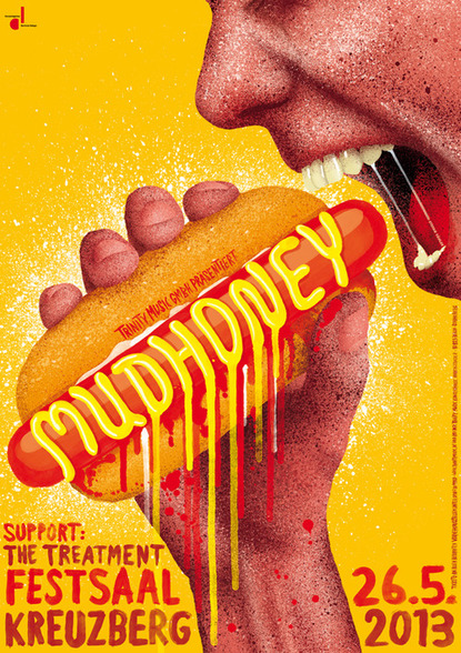
A poster that has been on one of my pinterest boards for a while is a Mudhoney gig poster, designed by Stefan Fähler. I recently came across it again while researching gig poster designers and it interested me in researching more of his work.

I originally found his work on Baubauhaus.com
This poster has always stood out to me. First is its bright, radiating colors. The use of texture, in the splatter and painterly type is unexpected with a slight 80’s retro feeling. Also, I appreciate the slight disgusting-ness of it. The name Mudhoney already makes me associate it with a punk style and I have always enjoyed the contrast of that with the imagery invoked by the name “Mudhoney.” So adding a sloppy, mustard-soaked hotdog causes even more of a tantalizing disconnect.
Fähler started by designing visual campaigns for bigger companies but has since stepped away from the agency environment and became an independent artist. His work is very well summed up in an article on exberliner.com. It writes, “Embracing carnal behaviour and bodily fluids, he never forgets the cherry on top, the whimsy.” This is what I appreciate so much in his work. Disgusting but without being overtly disgusting, yet still whimsical. That is a difficult dichotomy to balance. That is why this poster stuck out to me.
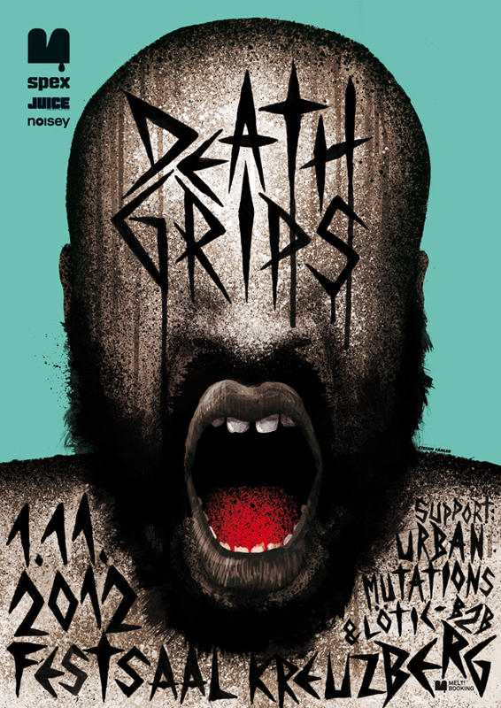
Here is another gig poster for Death Grips (photo cred from his website).
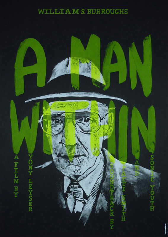
 I marvel at how he treats his type so differently for each poster. He always well integrates it in unique and inventive ways. For instance, the “Death Grips” gig poster compared to this poster for a film premiere (also from his website).

It has such a different mood and application which is great and refreshing. I also find it interesting that this is just a two-color screenprint. It shows how you can push one color’s many tones into an appearance of depth and richness. His work inspired my gig poster for Odesza quite a bit. I also used just two colors but with screens to make them seem like more. I integrated the large type into the composition, albeit in a more rigid and grid-like way.
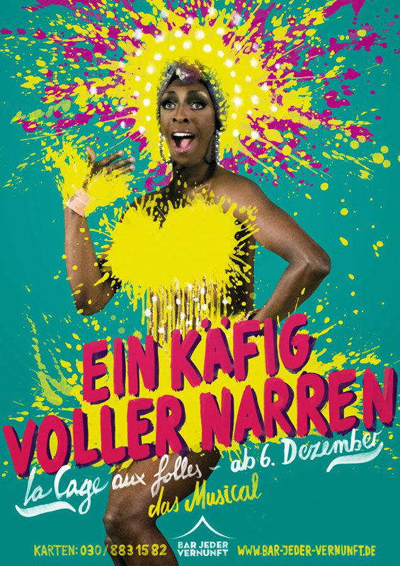
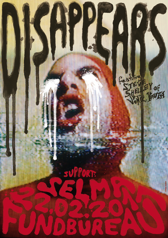
Stefan also seamlessly integrates photographic images into his work. Here are a couple examples:

How fun is this musical poster for La Cage aux folles?
 This is obviously a completely different mood and uses a grainy, distorted photo in the background.
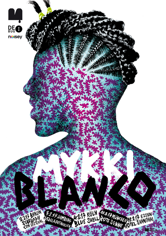
His use of pattern is also inventive and beautiful. Here are a couple of examples that use pattern but in very different ways.


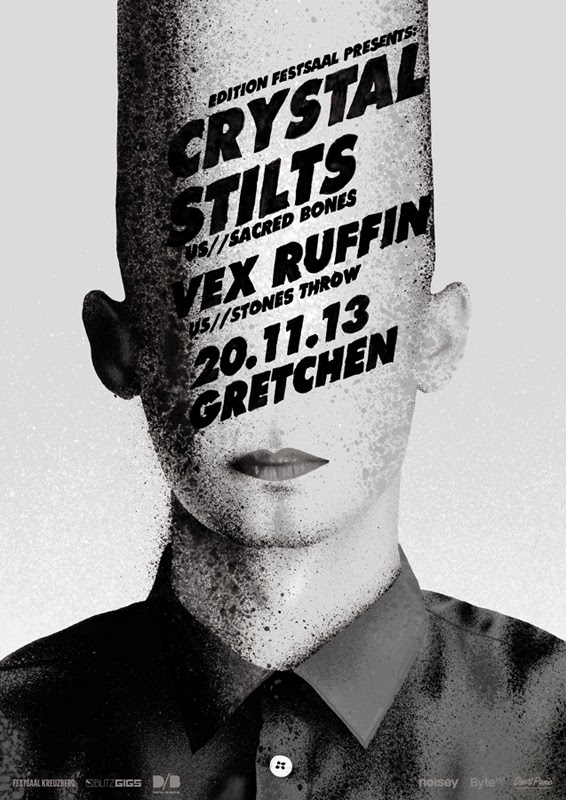
Everything in his compositions are so intentional and bold. His color choices contribute to this as well; they are unexpected and interesting. However I always feel a great artist can still make something eye-catching using just black and white.
 The one shows again his great use of type …on a conehead – awesome! His stippling spray effect works great as the high-contrast dynamic shading.
It was difficult to choose which posters to put in, so check out more of them on his website, where I grabbed the images for this post. They are all wonderfully freaky-deaky. Even more freaky-deaky are his films, providing the imagery of an acid trip without all the pesky brain damage.


