Menu Close

Month: February 2014

Banner Ads with Chateau Ste Michelle

In our blogging module today, we talked a little about the importance of banner ads. With print slowly dying, web advertisements are becoming even more important. I’ve had a little bit of experience designing flash ads in the past and know that it can be difficult to make them look good. It is something that you know everyone is annoyed by so you are always balancing eye-catching and obnoxious.

With this in mind, I approached Chateau Ste Michelle’s banner ads with simplicity. These ads are meant to be on “The Stranger” website so we could use a little humor.

screenshotwithads

So here is the screenshot of what the website would look like three different-sized banner ads. I noticed that the larger ad looks a little disjointed because of the stacked images, but I didn’t mind it. It looks more like content and less like an ad, which I think is good.

Here are the individual ads:

murphy_300x600

murphy_728x90 murphy_300x250


Slutting Up My Friends in the Name of Art

I would never say I am a “photographer” for fear of offending real photographers. However, I do enjoy putting whore-ish makeup on my friends (preferably after we have been drinking) and photographing them in various outfits and places. Then over-photoshopping their photos. It is a fun way to let loose and get out of my creative routine.

553230_10151084027161422_905609655_n

Here is an early example of photoshoots with friends. We were celebrating a girls’ weekend at our friend’s family’s beach house in Longbeach, WA filled with wine, tarot cards, and windy beach walks. I remember I had just watched a retrospective on Judy Garland’s life and became really interested in vintage photographs of actresses. It was amazing how much the actress’ appearance could change in a time before photoshop.

hezmarlene

483362_10151084027266422_1458283070_n

Another time at my place we did a more hipster-inspired shoot. I mean, anything is better with antlers right? I live in a loft with old wood floors so I made them just lay down and used that as the backdrop. We used some of my jewelry and I tried to get a little jesus-y with the light. It also didn’t hurt that I had happened to buy peonies, which worked themselves into the shoot.

IMG_2854

IMG_2798

IMG_2779

As you can see, my models/friends Angela and Heather usually come in a pair. Another time though, it was just Angela. Angela is an awesome model because she can really work her angles and isn’t afraid to take some risks. I call the one below a ’70’s porn star look.

IMG_2411

On another shoot with Ange, I was really feeling a wood nymph photoshoot with magical beings frolicking in the forest. Ideally, she would be nude but with sunsetting we didn’t have time to get to a more secluded spot. It is definitely another theme I would like to further explore.

final1 final3 final2

I have done impromptu photoshoots like these since I was young. My sister had a darkroom kit and we would do photoshoots and develop the photos together. It is something that I will always try to incorporate into my life.

Lettering with Marian Bantjes

Hand Lettering is not one of my strong suits, at least compared to the many wonderful hand letters of our class and the world.

That’s one of the reasons I’m so attracted to Marian Bantjes’ work. She does these insane, ornate letterforms and designs but they are still marketable and can be applied to different companies. I often refer to this Sak’s Fifth Avenue display she designed because how it achieved the difficult balance of artsy and marketable.

I also thought of her today because she is known for her Valentine’s Day cards, every single one unique. Here are a couple from a couple years ago. She used vintage postcards and did some hand lettering on them.

I like her interest in making the ordinary extraordinary, as with her macaroni art.

Here is her TED Talks video from a few years back. It’s a bit long at 20 minutes, but definitely worth the watch. In it, she discusses the balance of individuality in corporate work.

For Jill’s type class, we got the chance to practice some custom letterforms. I chose to make a package design for a fictitious “Pastor Will’s Soap” company, the other choices being chocolate or a cigar box. I really focused on the religious aspect this and referred to old, intricate bible covers with dark colors and Celtic manuscripts. What I like about these biblical references are how the ornamentation is so well integrated with the type. That is what I wanted to emphasize in my final design.

Murphy_Pastor_Wills_Page_6

It was a really great project since we were not allowed to use illustration, really just simple ornamentation. I like mixing old musty colors with new fresh ones, bold sans-serif with squirrelly script.

Blogging – 3 Favorite Blogs

I subscribe to around 150 blogs and am therefore inundated with a metric crap-ton of content. They are mostly graphic design and art based with a sprinkling of fashion. I don’t actually visit the blogs individually, I use feedly.com which keeps all of the RSS feeds in one place. (I used to use Google Reader which was unfortunately murdered.) Therefore, it does not really matter to me what the blog looks like, other than how the individual posts are laid-out, because I’m looking at them all through feedly.

My home screen on feedly.com

My home screen on feedly.com

Anything I enjoy and/or want to refer back to later usually ends up on my Pinterest of which I am also quite addicted to. It’s a sick, never-ending cycle of feedly to Pinterest, feedly to Pinterest . . .  It is great as inspiration, but I sometimes find it’s best to put it all away and get inspired by something that has nothing to do with design.

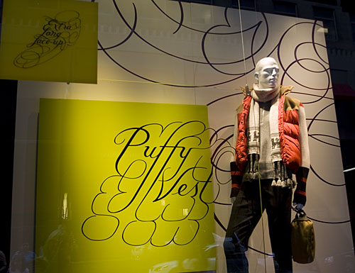
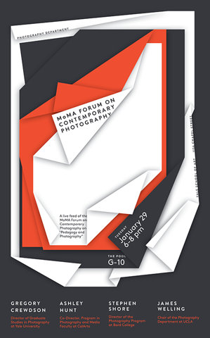
I have noticed that I pin images from some blogs more than others. Some are more obvious, like the ones we went over in class — DesignspirationBrand New, etc.

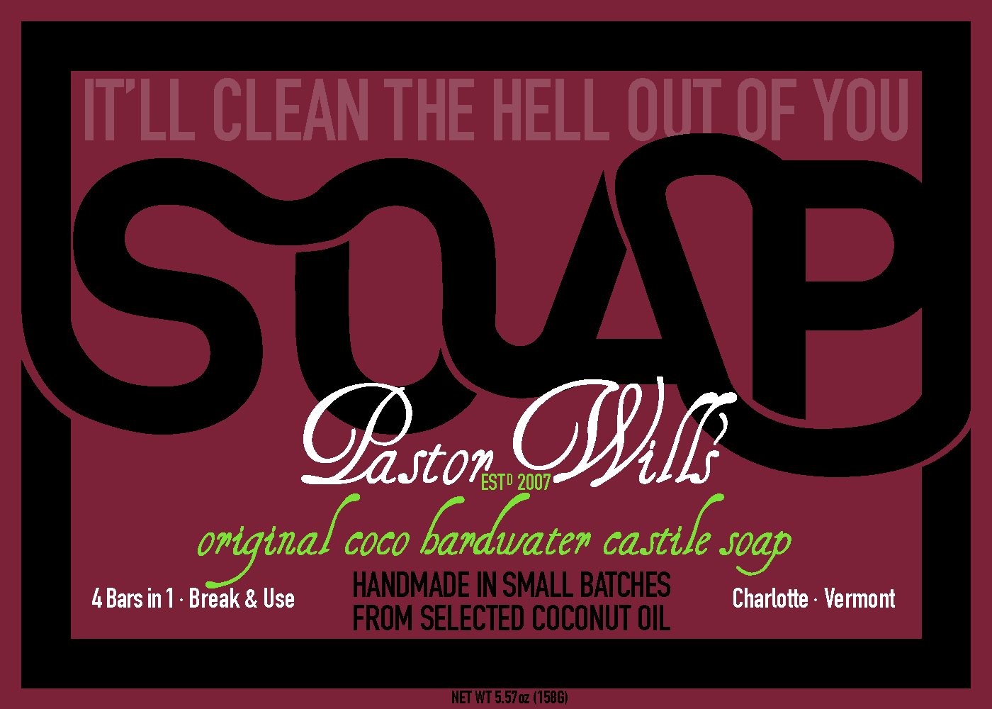
Along the same vein, I am fond of Designtaxi.com. I especially enjoy photos of branding identities probably because I would love to end up designing them.

osso

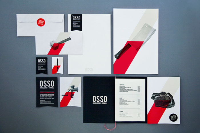
For instance, I am obsessed with this identity for “Osso,” a butcher shop. It is refreshing when companies take risks with their designs. Plus, this design is simple but bold.

plus they have a fun gif...weeeeeee

plus they have a fun gif…weeeeeee

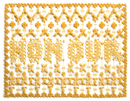
We also mentioned ffffound.com in class which is great because it is just one image per post, without any explanation or text. Sometimes the images are random and fun, other times, they are just great examples of design.

9dc7f223c0cb458c673f036b5d17ba157f9b083f_m

Other times they are funny gifs. And once in a while there are just random tits. I have to admit tits are great and all, but now whenever I see tits on ffffound, I’m like ohh . . . big tits . . . again. But it’s designer-y because it is in black and white. Maybe it’s just my closet feminist ideals, but it frustrates me because I am reminded the blog is so obviously from a male’s point of view. It frustrates me that in general, many of the “rockstar” graphic designers are male even though in graphic design programs, it is disproportionately female.

f7e22c1af1ce5b1f872054f4c85bd7b195c1b7dd_m

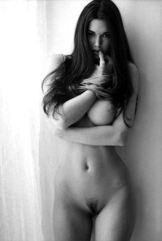
gratuitous tits for who?

Sorry about that, sometimes that inner feminist breaks through.

Another blog I like is FPO: For Print Only. In a design world where print is becoming more and more obsolete it may seem silly to focus on print. But what is very cool about it is the details of the printing job.

CANTRELL_Id_LOMM_01
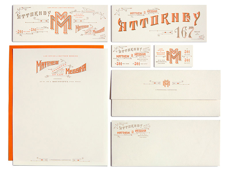
This gorgeous, almost over-the-top stationary design is broken down by cost, time it took to make, and process.

Screen Shot 2014-02-07 at 2.54.00 PM
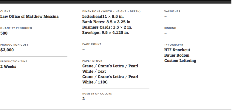
It is a rare look into the production side of something and grounds you about how realistic a design is to produce.

So those are few of the many blogs I find interesting.

© 2024 Seana's blog. All rights reserved.

Theme by Anders Norén.