Menu Close

Month: May 2014

#TBT


Remember this?
sketches8It was Jill’s first day of class icebreaker. The first person (me) writes down a short sentence. Notice I was trying to be cute with my nod to typography. The next person draws an image of the sentence. The next person looks at that image and writes a sentence explaining what it is, and so on and so forth, like an effed up game of telephone. It is an exercise about visual communication (plus it makes a great drinking game). The way mine turned out always made me laugh and as our first year at SCCA is coming to end, I thought it would be appropriate to share it.

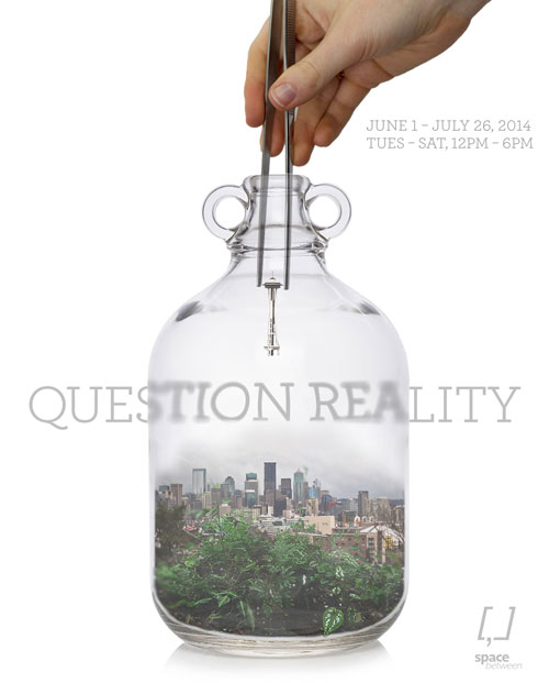
 

Question Reality

This poster was for a fictional gallery exhibit and was done entirely in Photoshop.

murphy_exhibitposterI kept wanting to do something with the Seattle skyline and one of Galyn’s terrariums inspired me to put it in one. Combined with a photograph of April’s hand holding some terrarium tweezers, I had my poster. It helped me learn quite a bit about photoshop techniques but that I have a lot more to learn.

#TBF

jillsproject

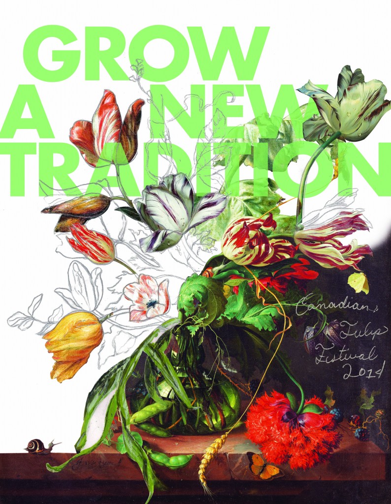
This throwback Friday (that’s not a real thing I know) is our first real design poster done waaay back in Fall 2013. I have been meaning to add this to my blog for a while, so here it is. Looking back, I still very much like this poster though I feel as if that is a bad thing. You are probably not supposed to like things you did in the beginning of the year because you are supposed to think hey I could have made it so much better. But whatever, I like it.

Something that Jill said I could improve on, which I agree with, is the “Canadian Tulip Festival 2014″ type treatment. I wanted to tie it in with the graphite pencil drawings, but it isn’t well incorporated into the design.

But like I said, I like it. I pulled Dutch still-life paintings of tulips and photoshopped them together. Then I traced over it with pencil and scanned it in. My concept was: join in with the tradition of the tulip festival while making your own traditions.

Package Design

IMG_3616 copy

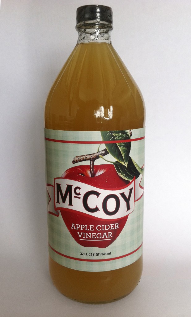
This is our first project for Package Design Class. Our parameters were that it had to be a glass bottle, but no wine or hard liquor. Our target audience was middle America, which to me meant our instructor did not want any hipster nonsense.

As a vinegar lover, I went for Apple Cider Vinegar and channeled that vintage-inspired fruit box style. I was picturing a label that had not changed in 50 years except for a couple gradients here and there.

© 2024 Seana's blog. All rights reserved.

Theme by Anders Norén.