
In our blogging module today, we talked a little about the importance of banner ads. With print slowly dying, web advertisements are becoming even more important. I’ve had a little bit of experience designing flash ads in the past and know that it can be difficult to make them look good. It is something that you know everyone is annoyed by so you are always balancing eye-catching and obnoxious.
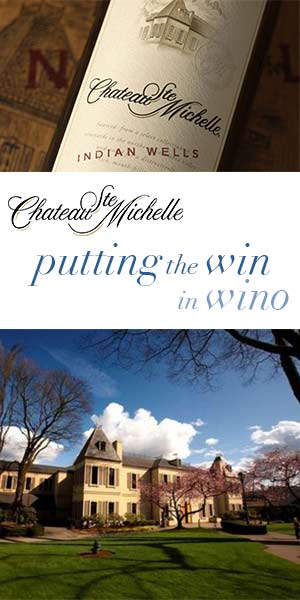
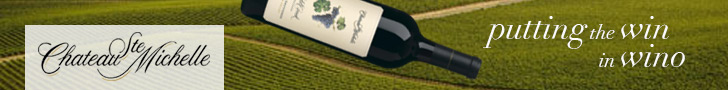
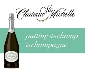
With this in mind, I approached Chateau Ste Michelle’s banner ads with simplicity. These ads are meant to be on “The Stranger” website so we could use a little humor.
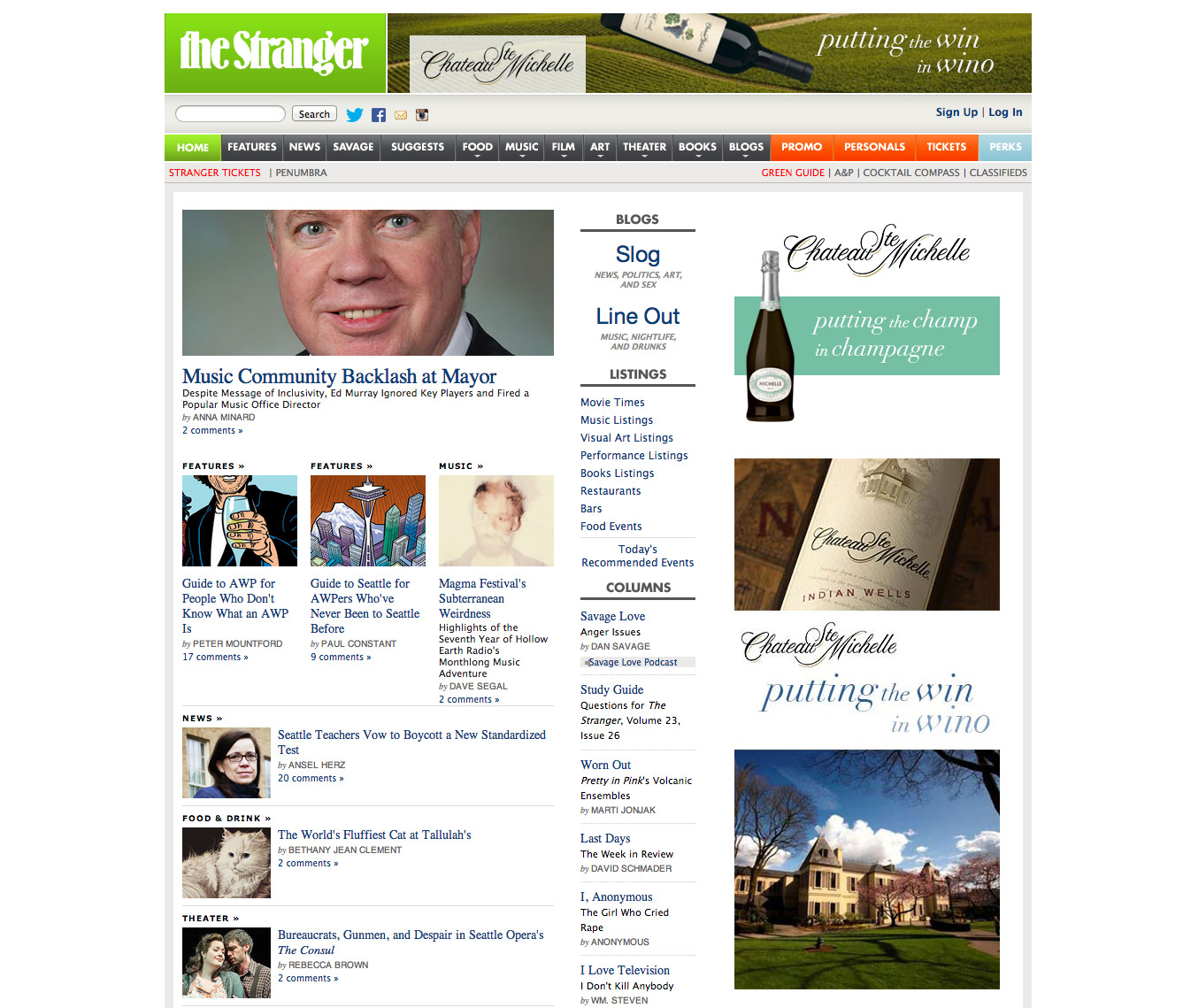
So here is the screenshot of what the website would look like three different-sized banner ads. I noticed that the larger ad looks a little disjointed because of the stacked images, but I didn’t mind it. It looks more like content and less like an ad, which I think is good.
Here are the individual ads:
Comments are closed.