This week I decided to switch gears and focus on branding. They already have a logo and do not want the concept changed, but it needs to be streamlined and tweaked. It also needs a concise color palette and typefaces because they are not solidified.
Here are their previous logos:
![]()
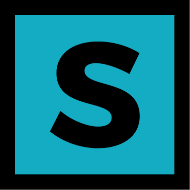
![]() Here is the logo that I polished a little for a shirt they had produced.
Here is the logo that I polished a little for a shirt they had produced.
![]() But I do think it needs to be simplified.
But I do think it needs to be simplified.
Hum Creative came in on Monday and they went over some great ways to concept. One that I implemented was to create 3 simple moodboards with different color palettes, photo styles, and typefaces. I came up with the adjectives by doing a brain dump and trying to establish their target audience.
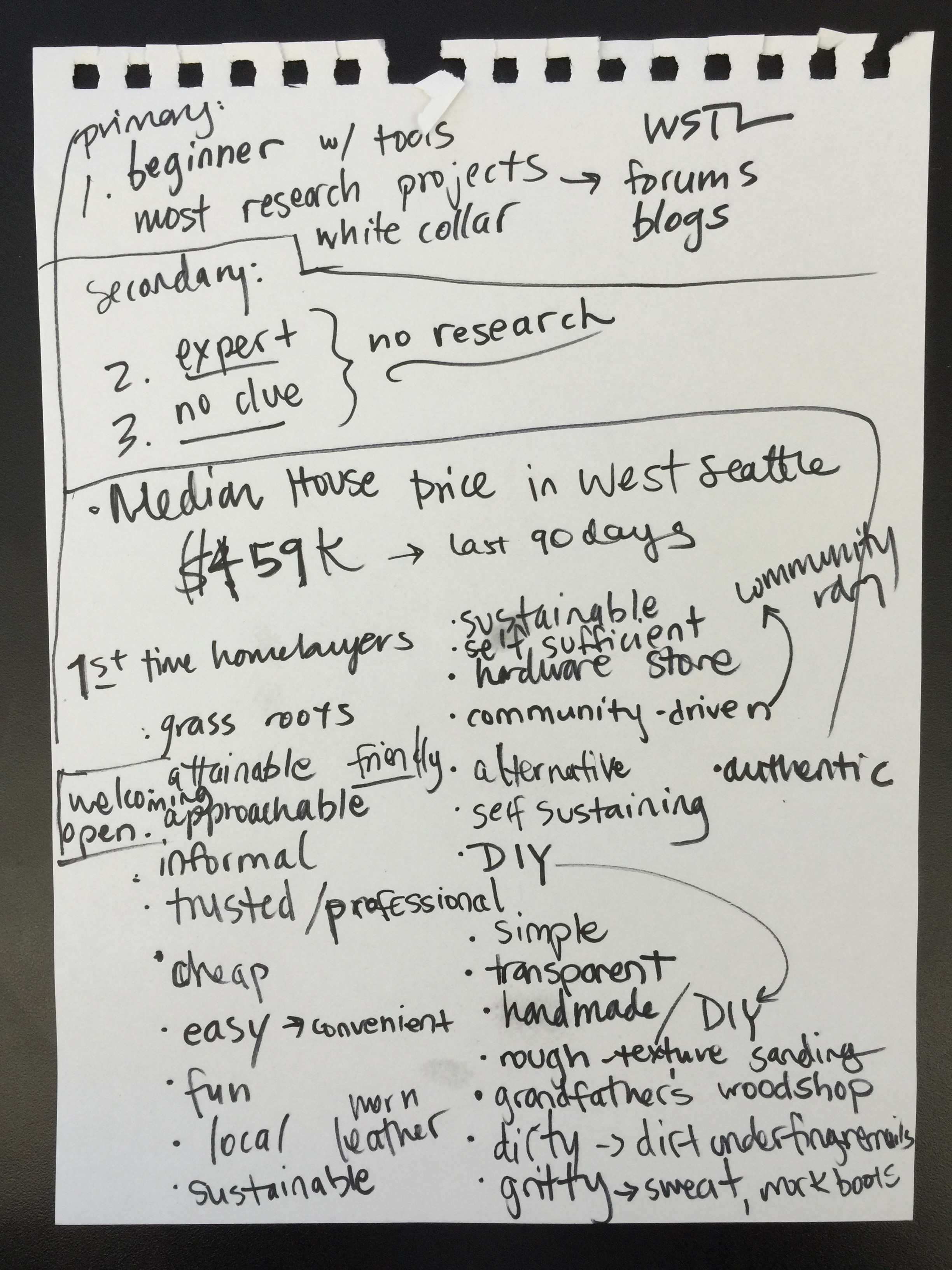
Brain Dump
Here are the three moodboards:
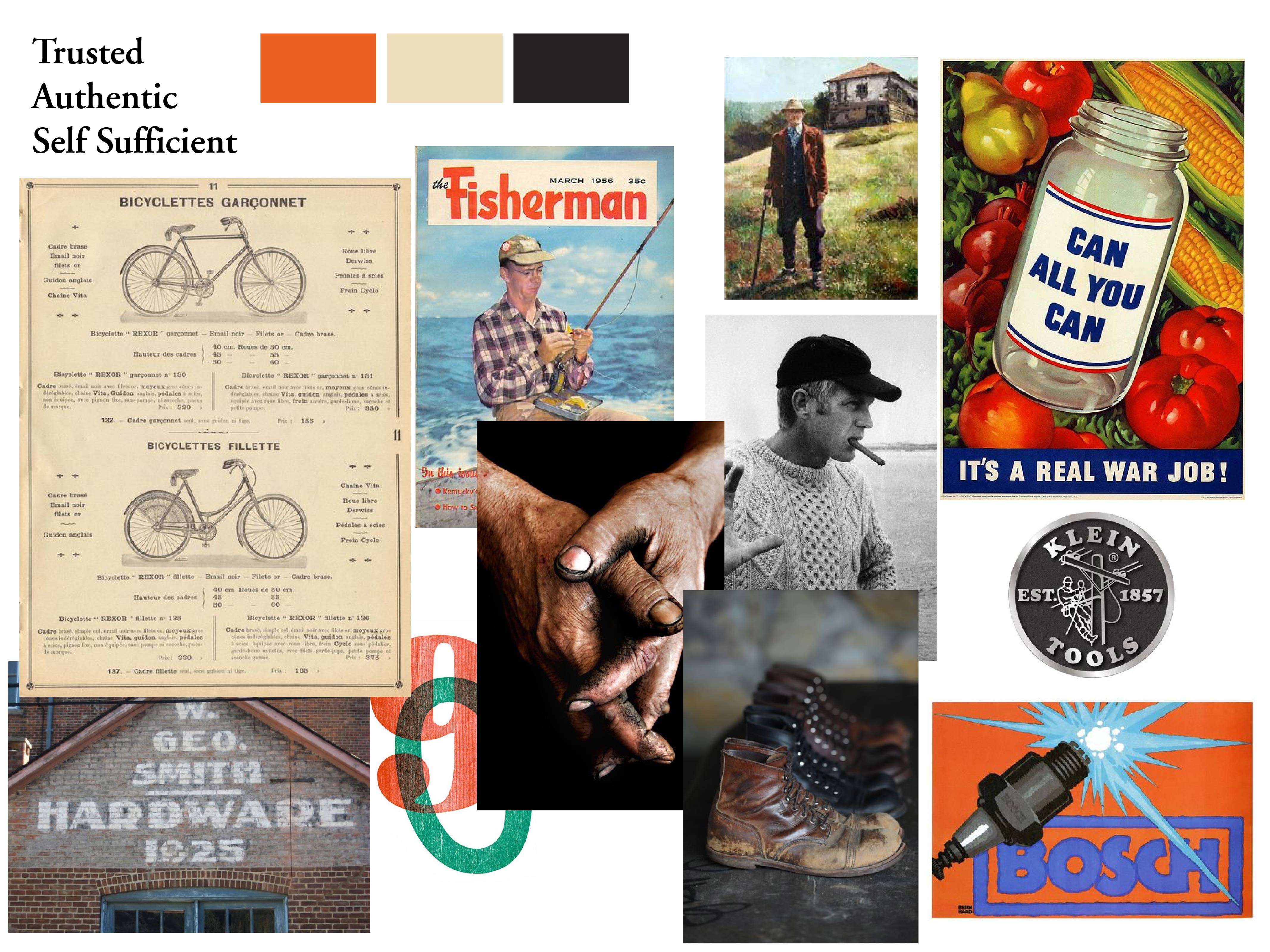
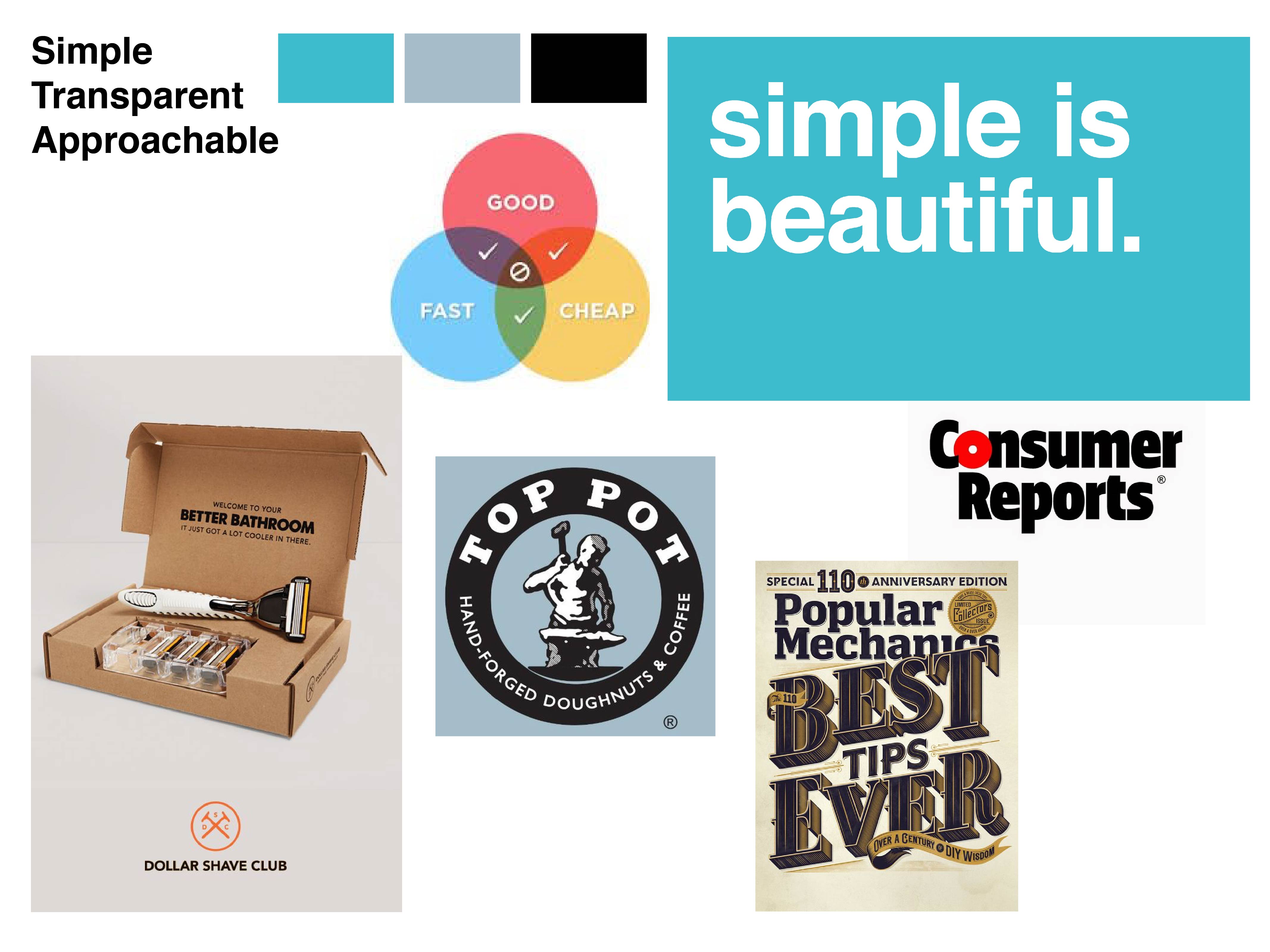
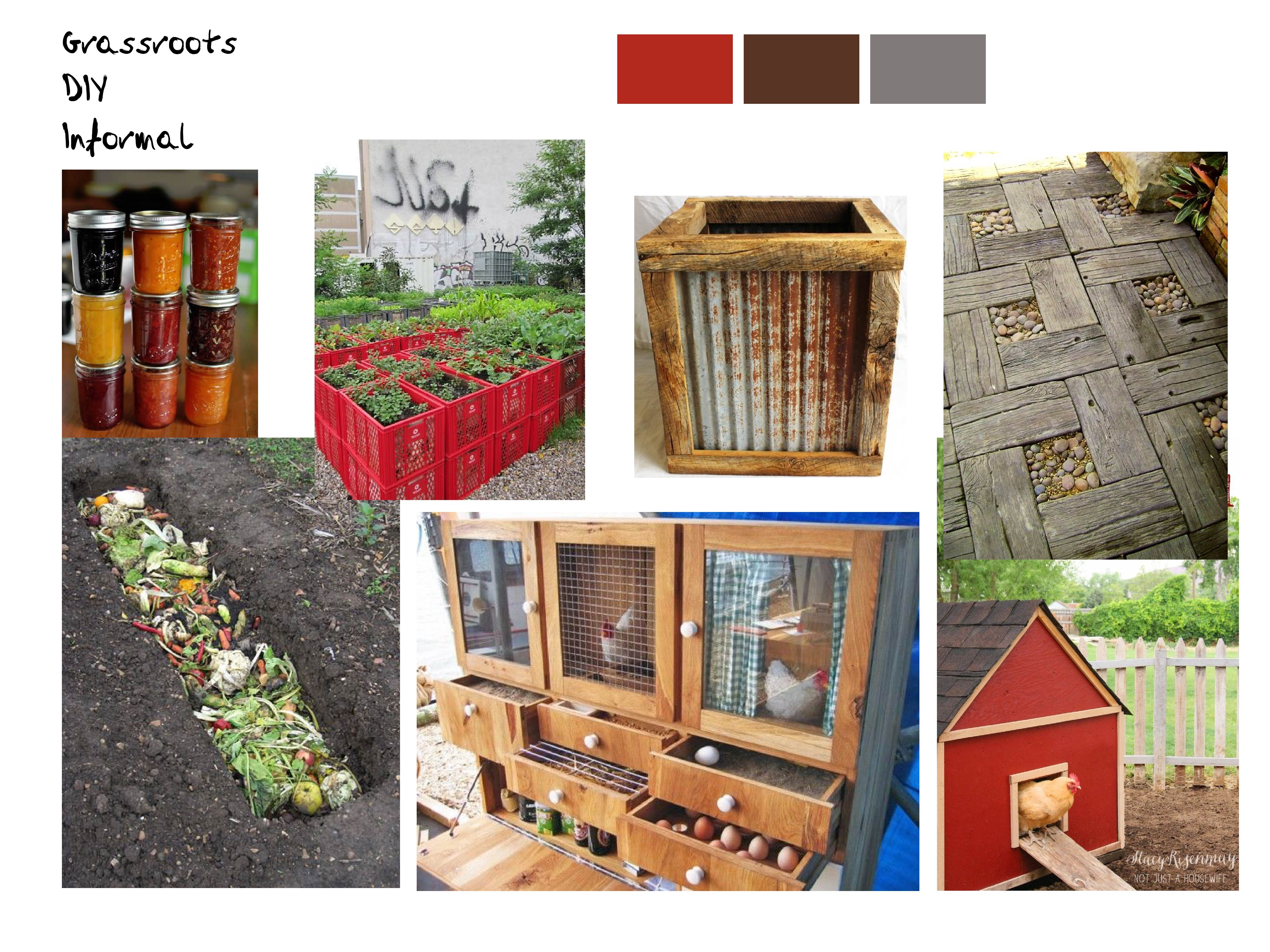 They are rough but still convey 3 distinct moods and feelings. I will run them by Brian and main tool library users to see which one they are leaning towards.
Comments are closed.